How to Customize the Speaker Widget for a Virtual Event in Zuddl
Last updated: August 1, 2025
The Speaker widget lets you create a widget that displays your event speakers, customize it using CSS, and embed it in your website.
To set up the Speaker widget:
In the event setup, go to Settings > Widgets tab.
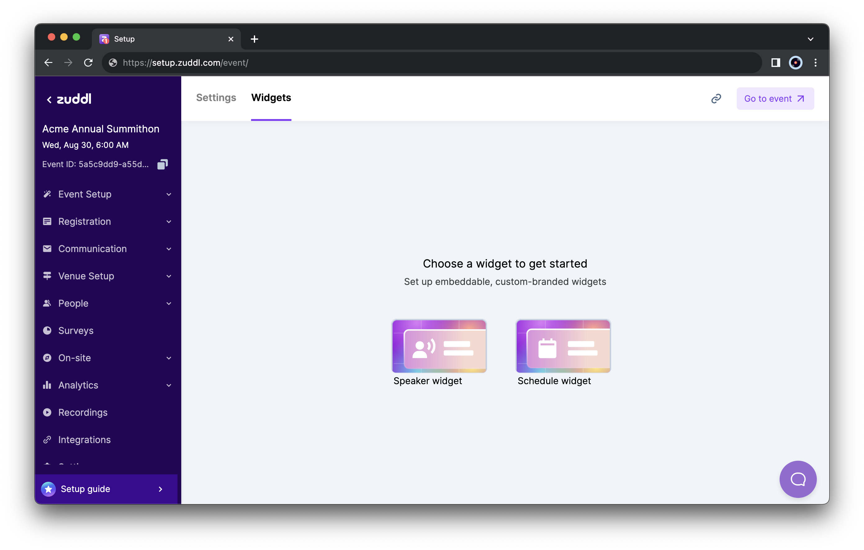
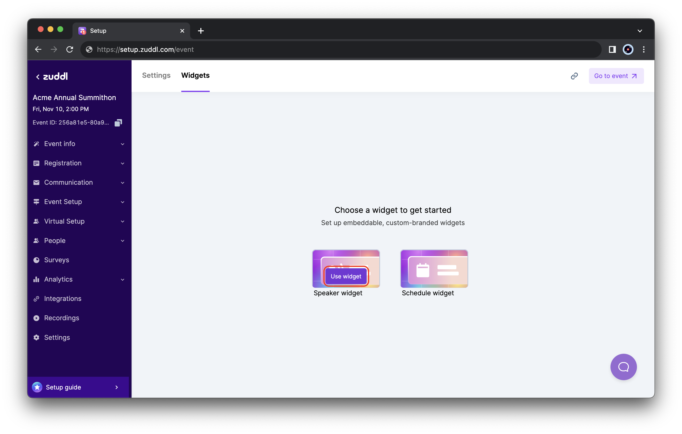
The widgets page On the Speaker widget card, click the Use widget button. This creates the Speaker widget.
The speaker data added in the event setup is automatically synced to the widget. You can customize which speakers to display under the Speakers section in the sidebar and the speaker details in the widget under the Widget settings section.
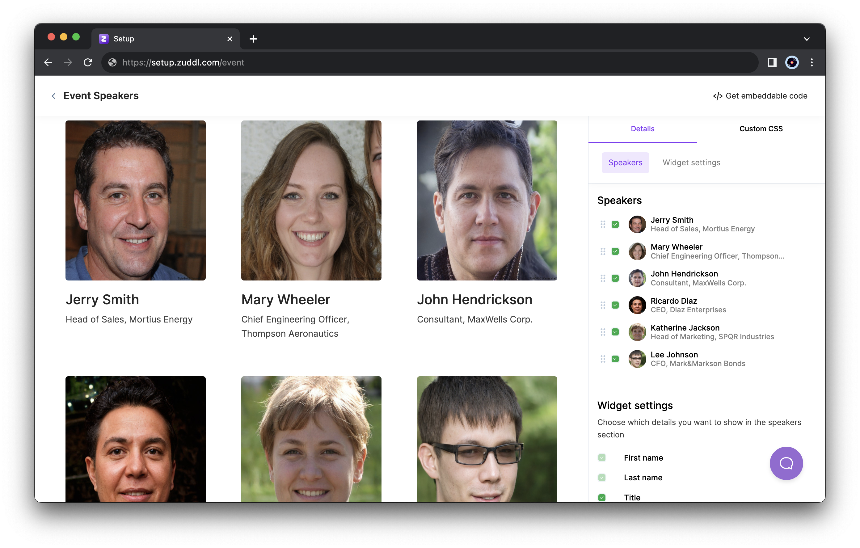
Customize the content of the widget
Customize widget branding
To customize your branding,
After customizing the speakers and displaying the speaker details, click the Custom CSS tab in the sidebar.
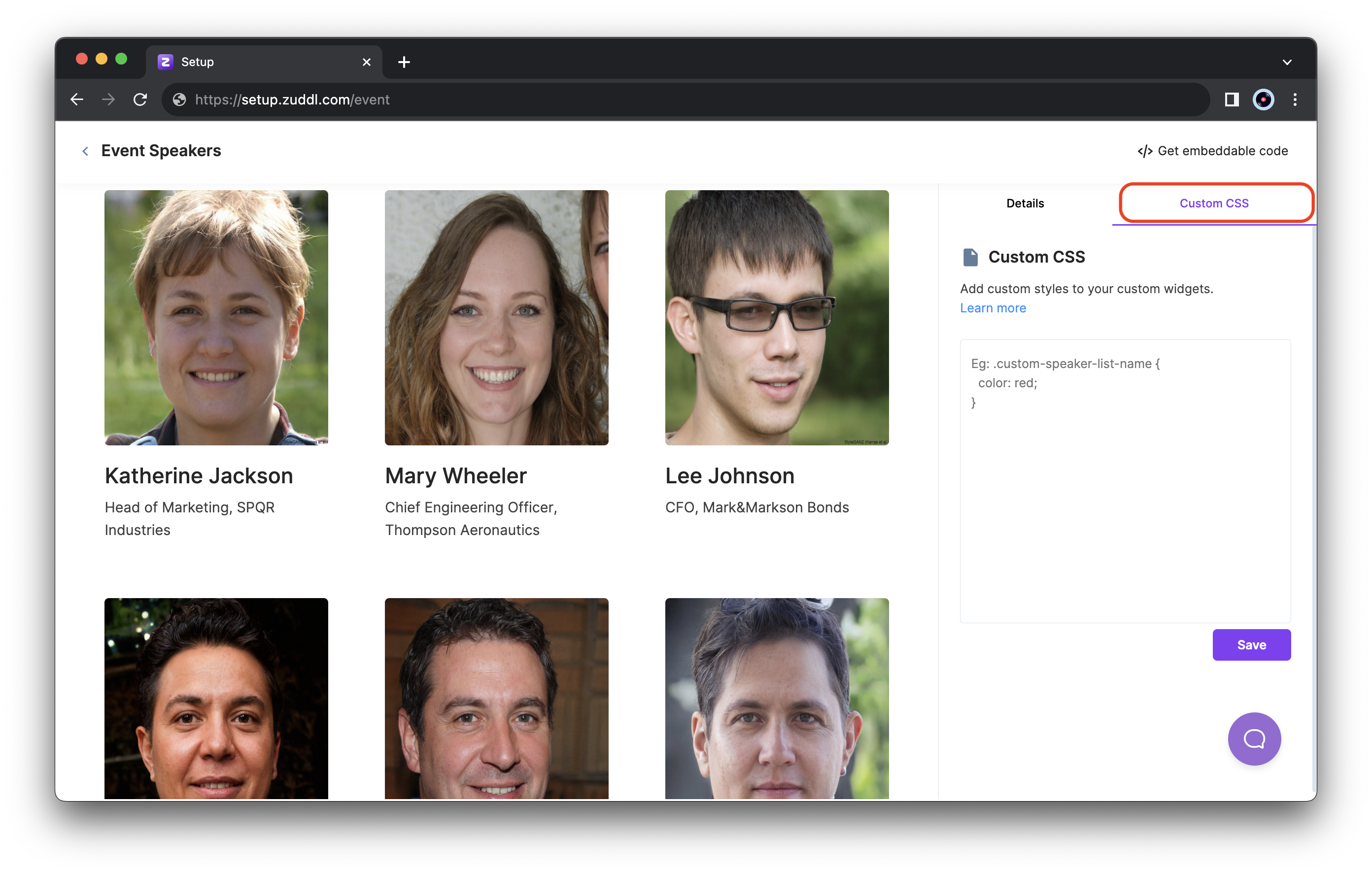
The Custom CSS tab In the code text area on the right, you can enter your custom CSS code to customize the widget's appearance.
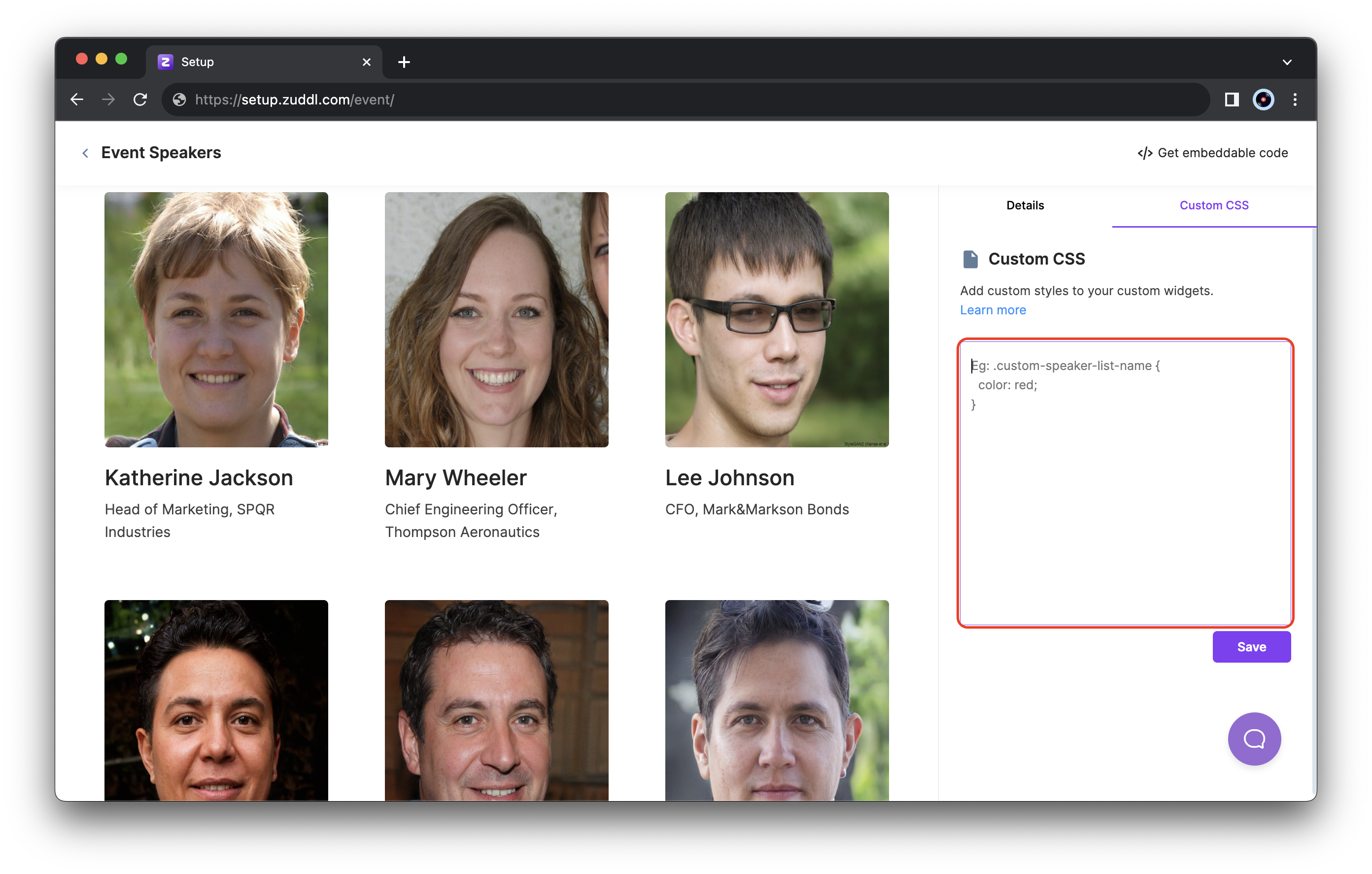
Enter your CSS code here - Click Save to apply these changes to the widget.
CSS classes for the widget
Currently, you can use the following classes to style the Speaker widget:
Speaker CSS classes
| Class name | Description |
|---|---|
| custom-speaker-list-image | The speaker's image is shown in the list. This is applied on the |
| custom-speaker-list-name | Name of the speaker in the list. |
| custom-speaker-list-title | Title and Organization of the speaker in the list. |
| custom-speaker-list-background | The background color of the entire speaker list component. |
| custom-speaker-popup-image | The speaker's image in the popup is what you see when you click on an individual speaker item, which opens a model. |
| custom-speaker-popup-name | The speaker's name is in the popup. When you click on an individual speaker item, it opens a model. |
| custom-speaker-popup-title | The speaker's title is in the popup. When you click on an individual speaker item, it opens a model. |
| custom-speaker-popup-description | Speaker's description in the popup: when you click on an individual speaker item, it opens a model. |
| custom-speaker-popup-social-links | The speaker's social links are in the popup; when you click on an individual speaker item, it opens a model. |
| custom-speaker-popup-background | Background in the popup: when you click on an individual speaker item, it opens a model. |
Best practices
- You cannot inspect the page and use any classes given as it may not give you the intended results. Use only Zuddl custom classes listed for branding customizations.
- Add "!important" on properties that aren't behaving as expected, which may be because of any existing class. This tag will give precedence to the CSS.
- Do not use