How to Customize the Schedule Widget for a Virtual Event in Zuddl
Last updated: April 1, 2026
The Schedule widget lets you create a widget that displays your event schedule, customize it using CSS, and embed it on your website.
Creating the schedule widget
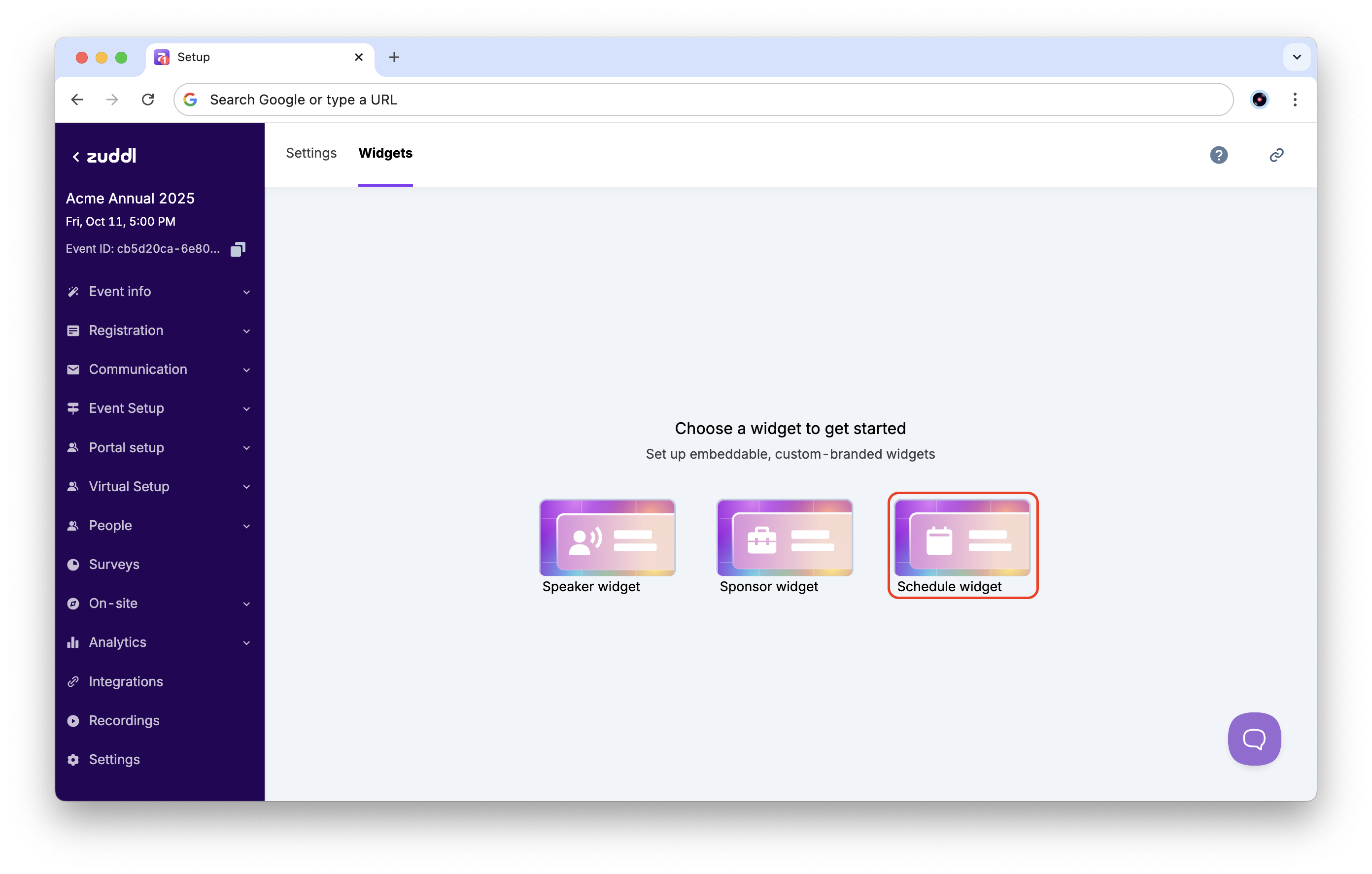
To set up the Schedule widget:
In the event setup, go to Settings > Widgets tab. Choose the Schedule widget from the list.
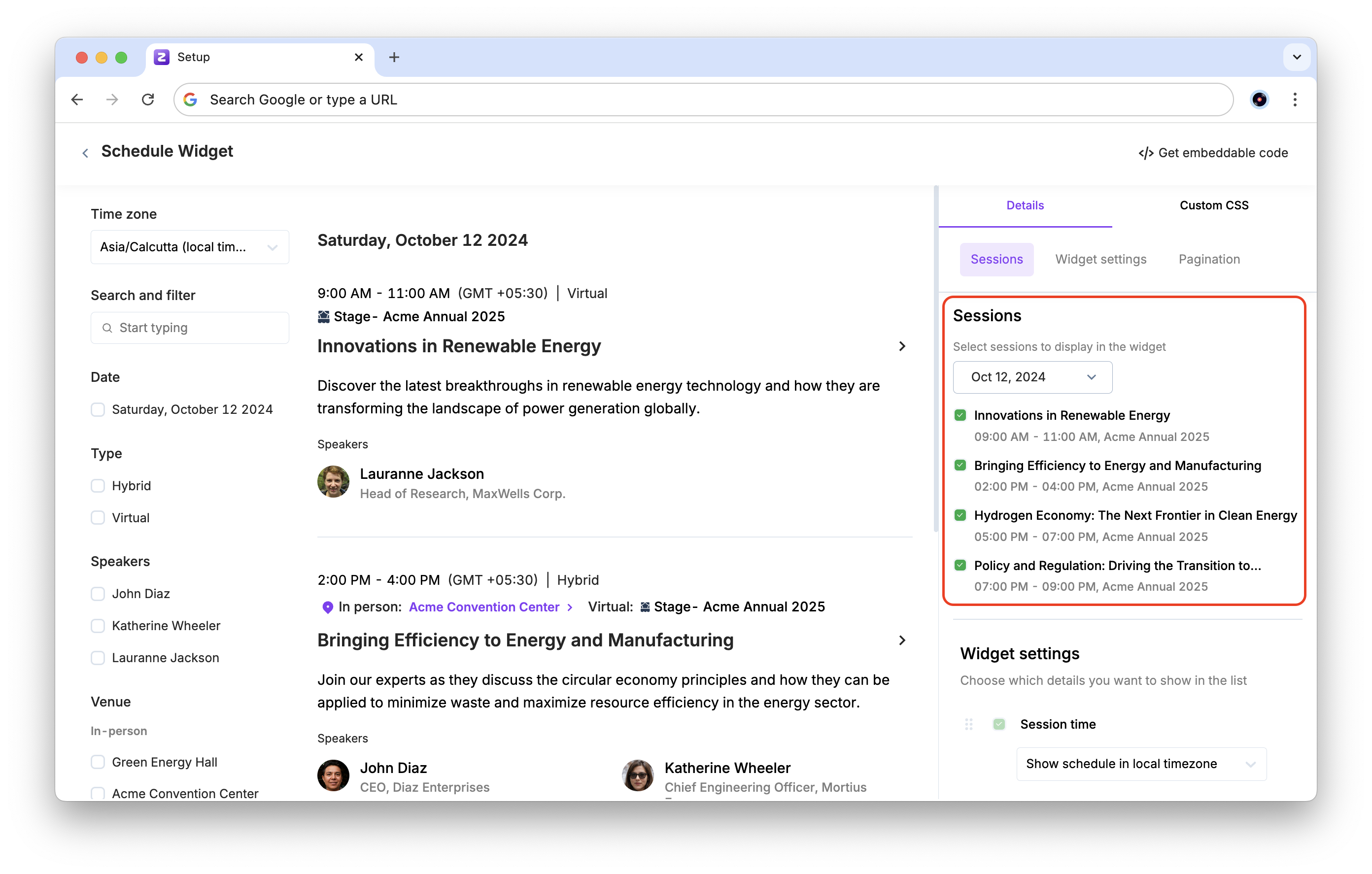
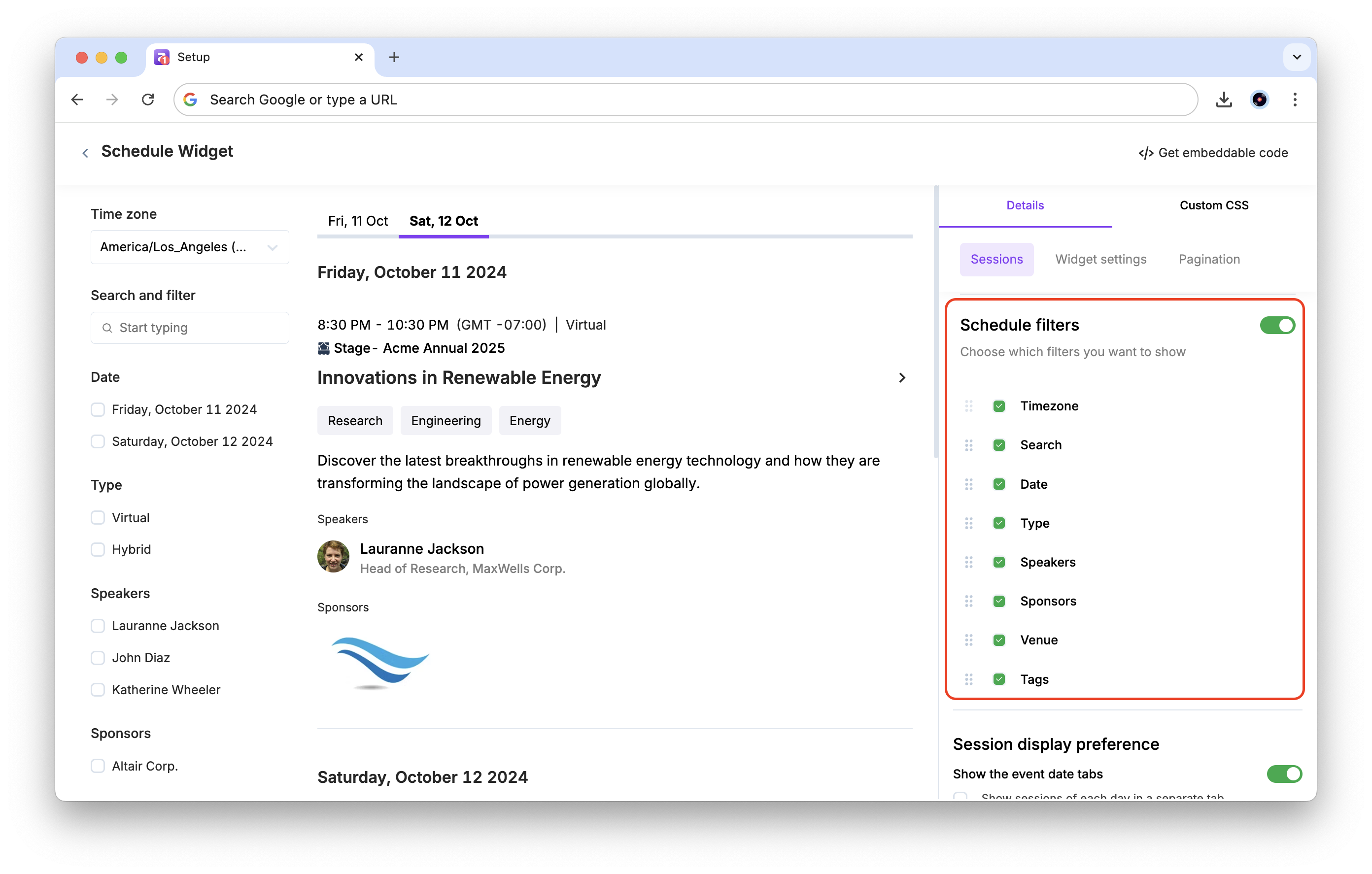
The session data added in the event setup is automatically synced to the widget. You can customize which sessions to display in the widget under the Sessions section in the sidebar.
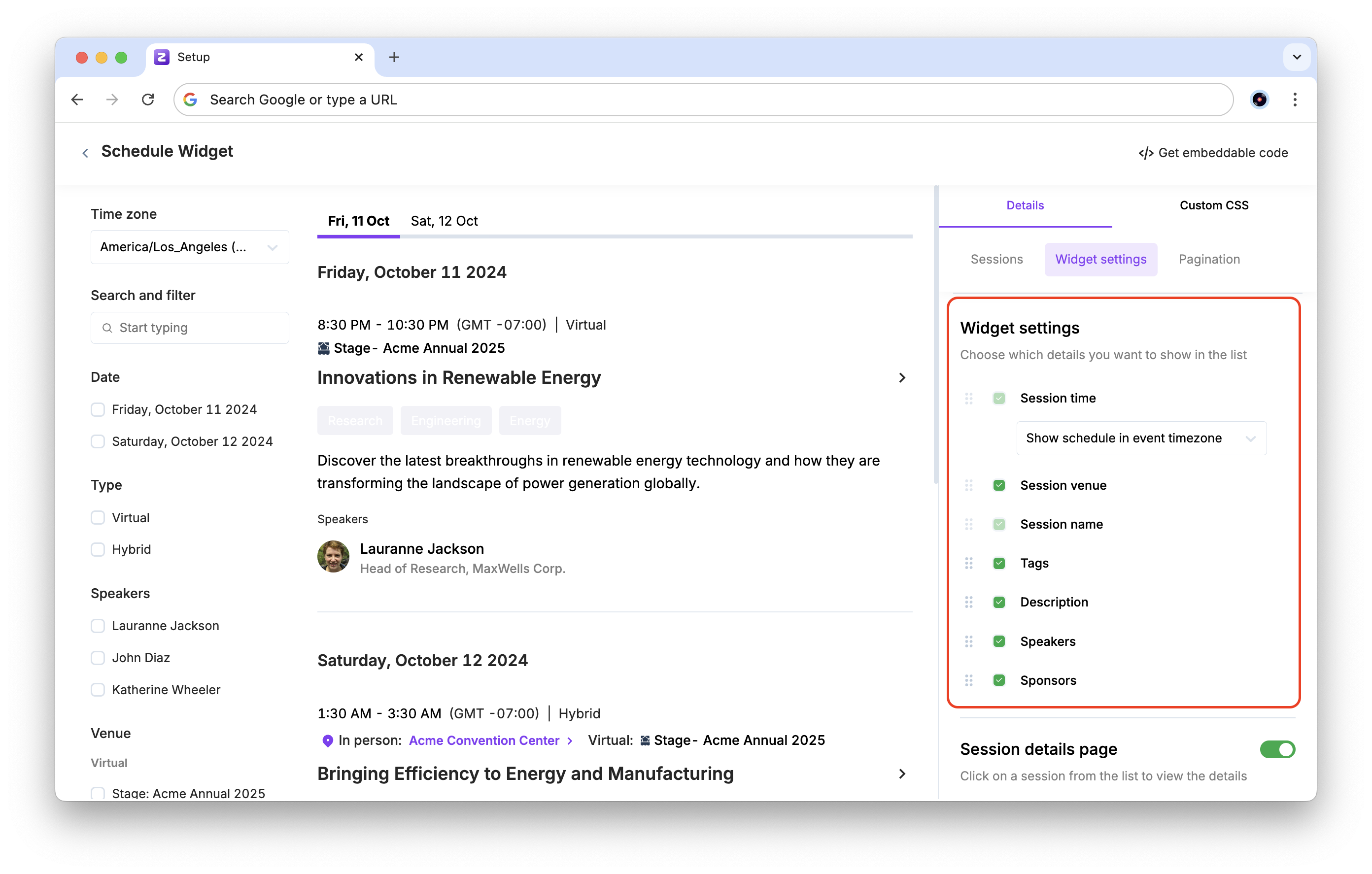
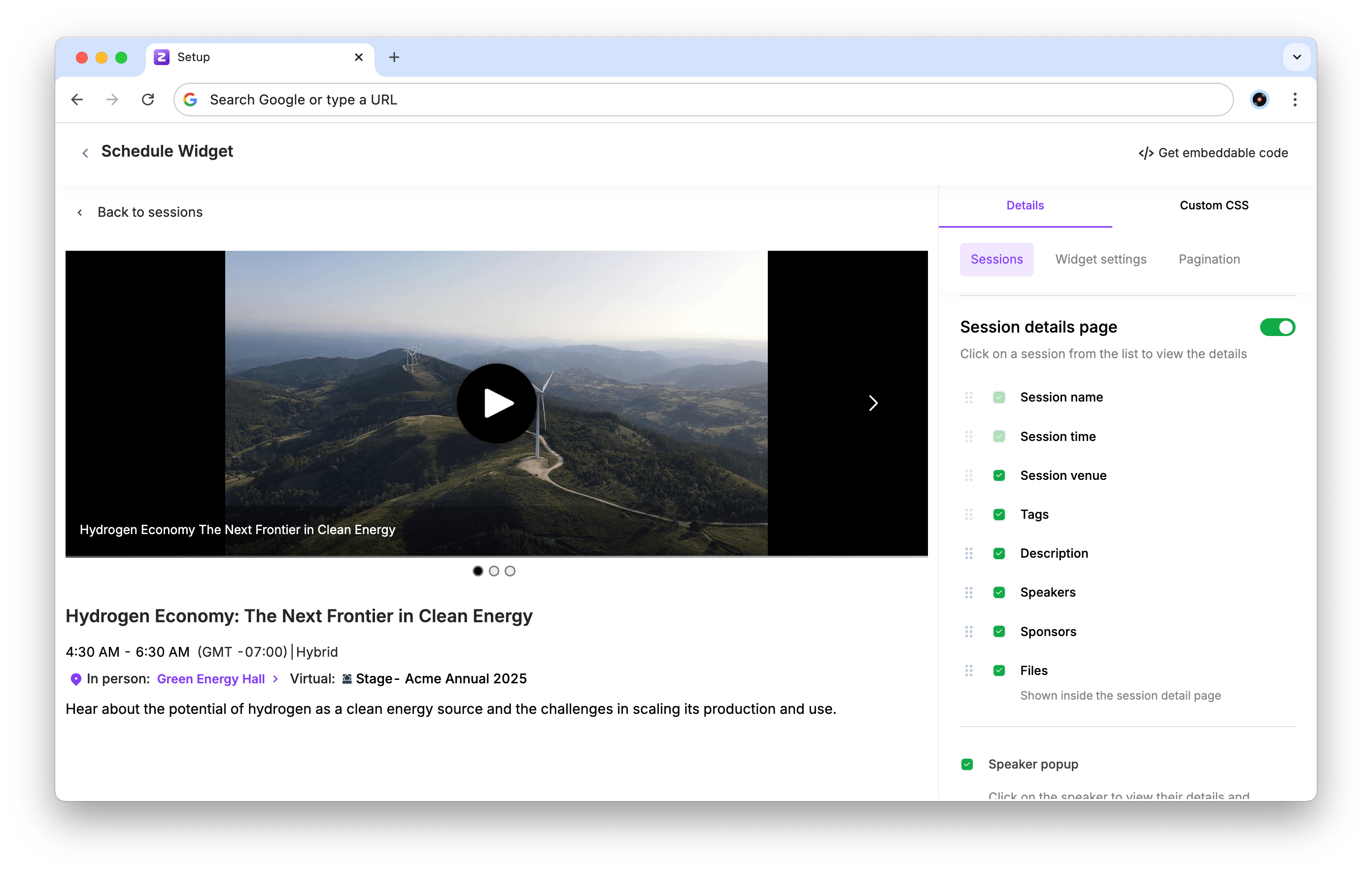
The Widget settings section lets you customize the details shown for each session in the widget. Session time and Session name are mandatory, the other details can be hidden as required.
The Session details page (enabled by default) shows a separate page for each session, which can be accessed by clicking on the session in the list.
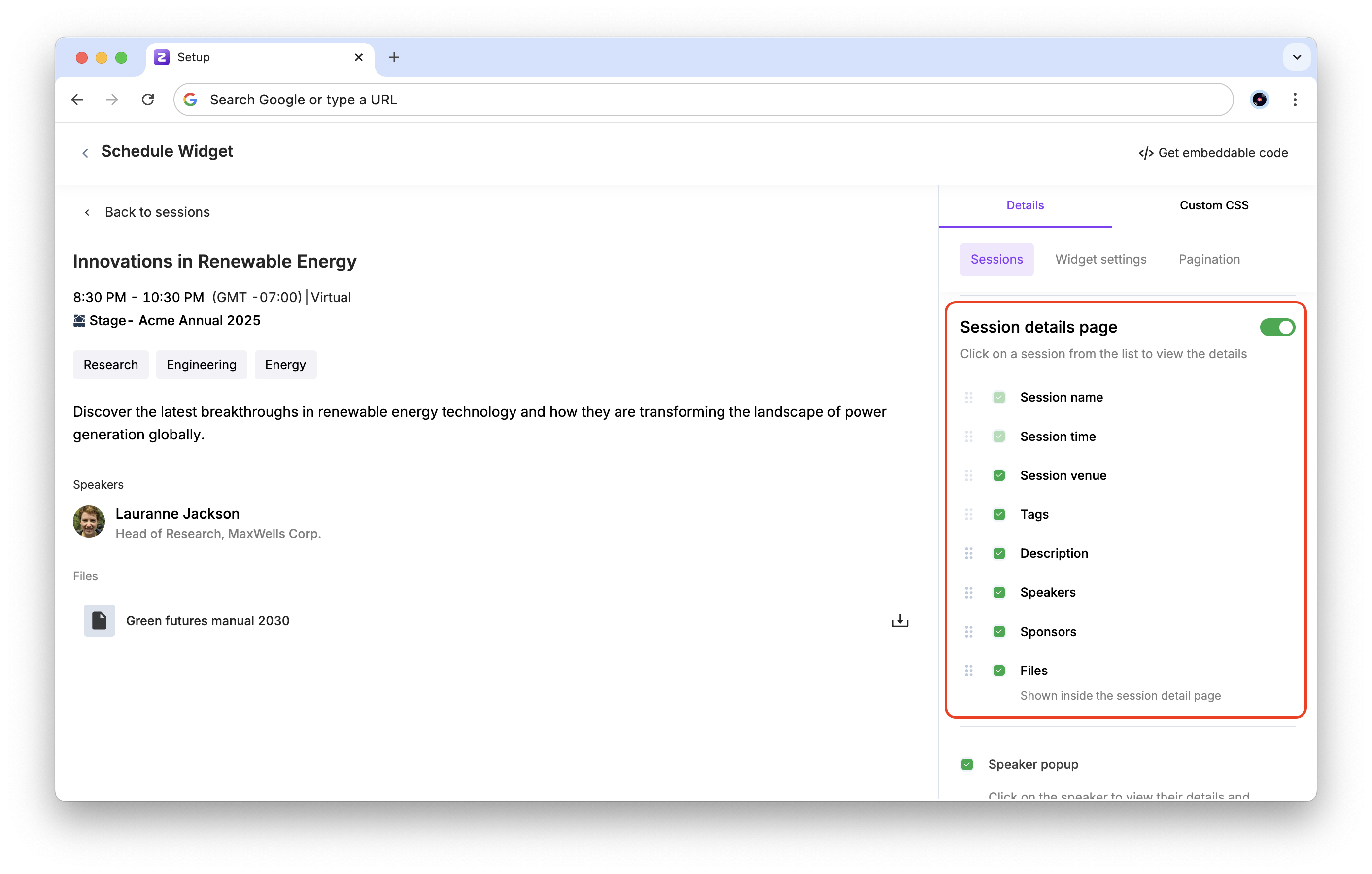
Any published recordings are also shown in the session details page for that session.
There are two popups available in the schedule widget: the Speaker popup and the Sponsor popup, which show the details of speakers or sponsors in a popup when you click on a speaker or a sponsor respectively. Both can be individually enabled or disabled.
For speakers, you can also choose to show or hide the sessions that the speaker is a part of using the Show sessions the speaker is part of checkbox.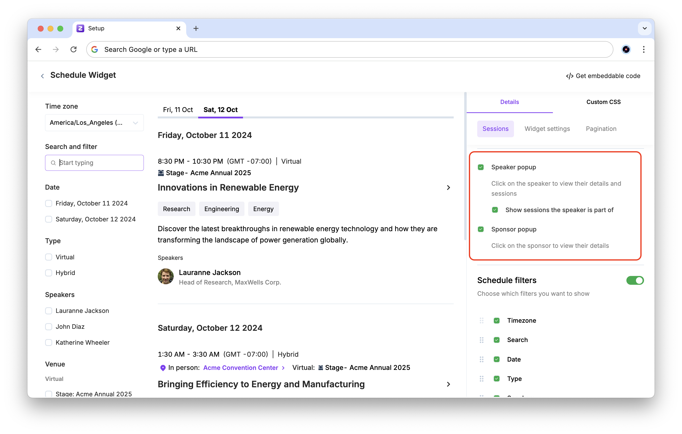
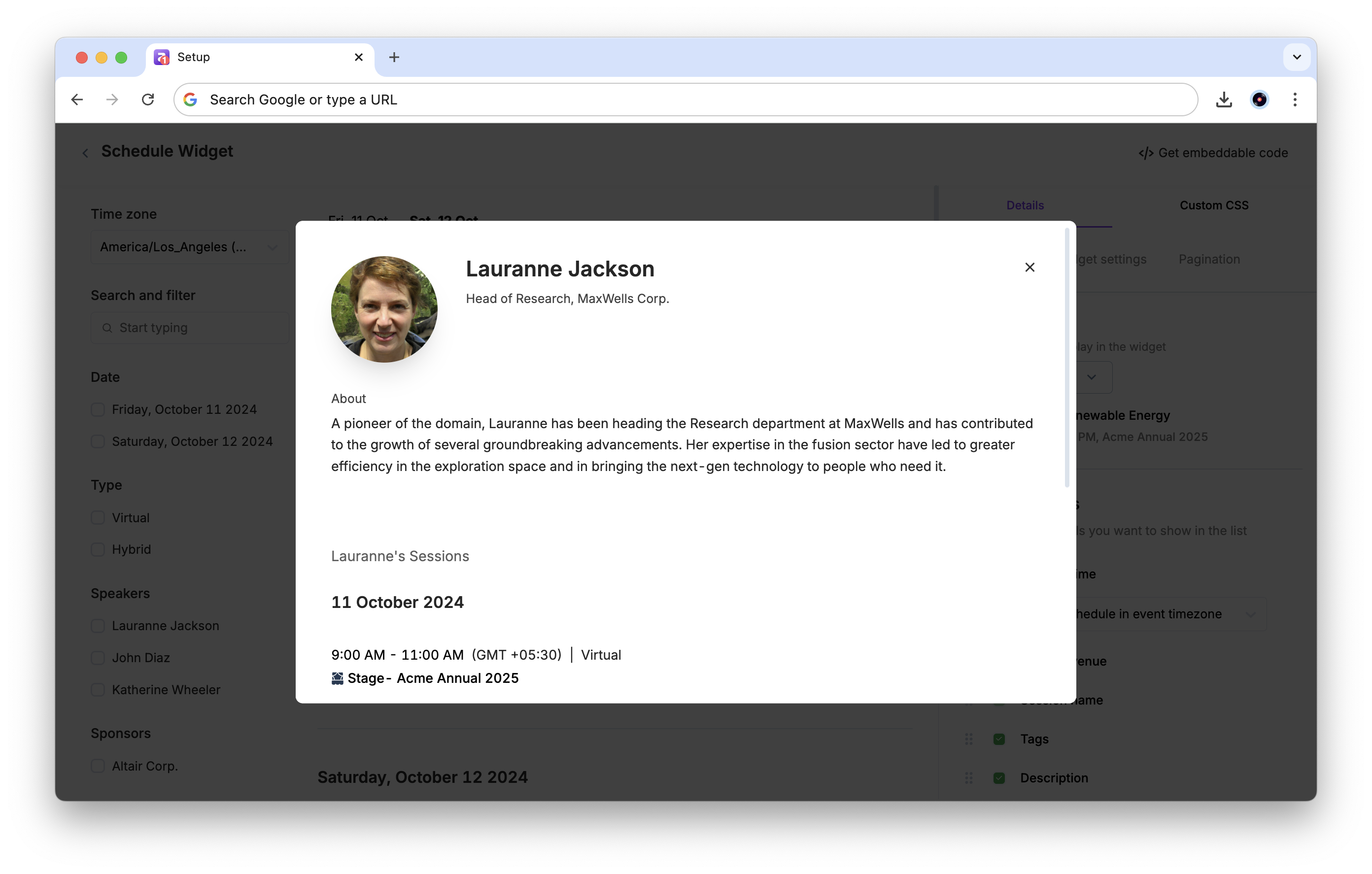
An example of the Speaker popup:
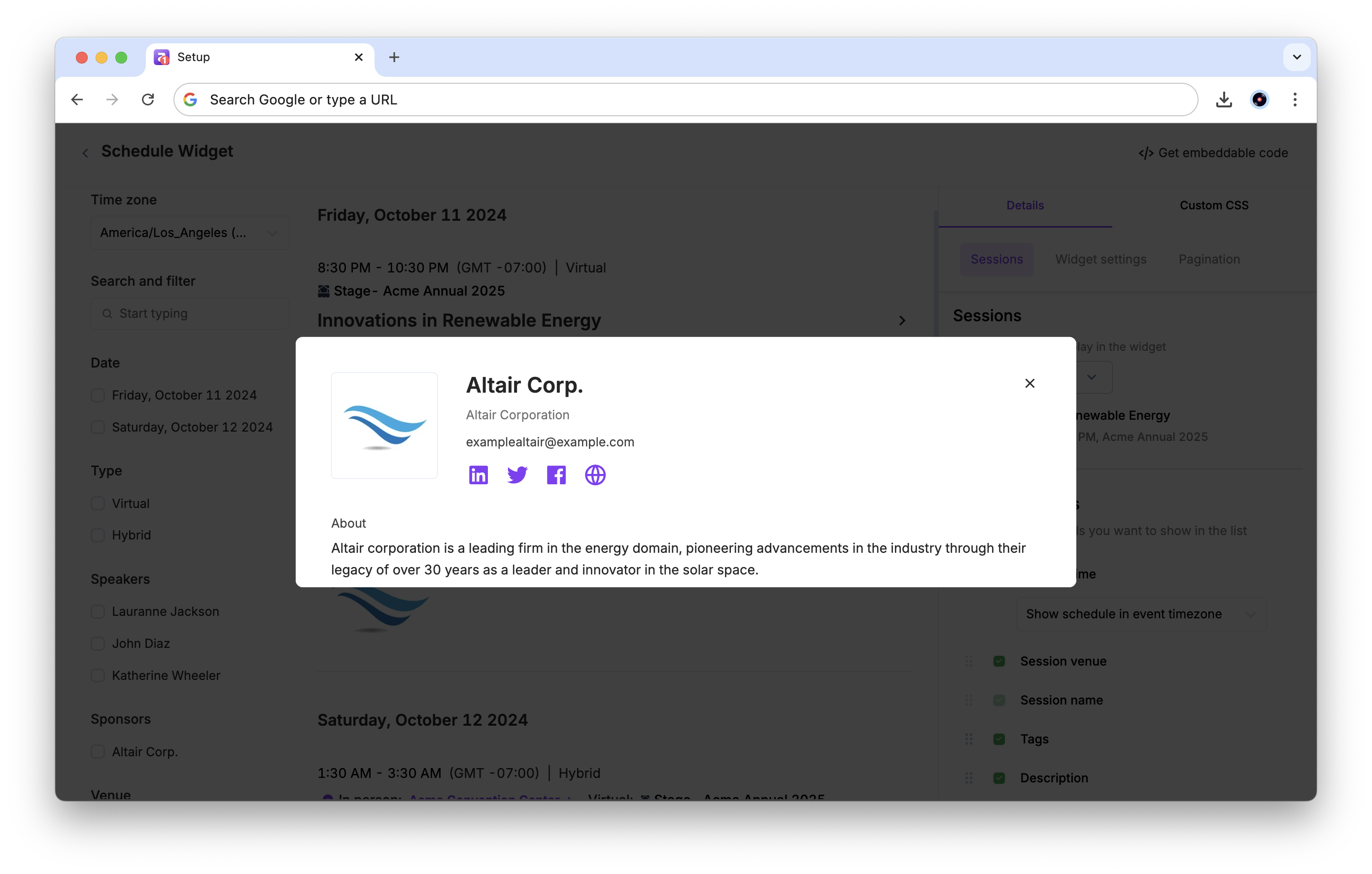
An example of the Sponsor popup:
The Schedule filters (enabled by default) let you select what filters to show in the left sidebar for the widget. These filters help attendees to sort through the sessions.
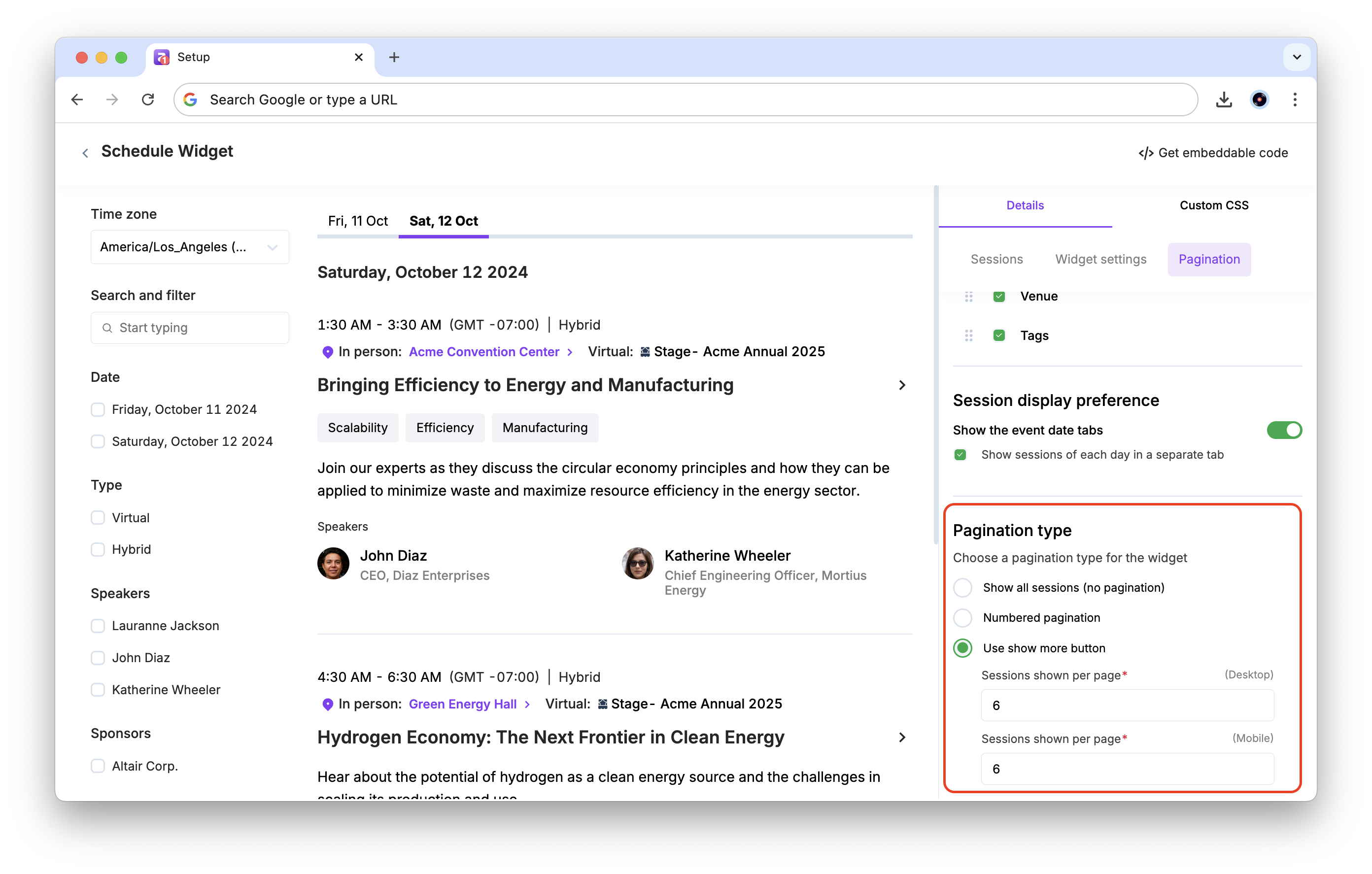
You can also select your preferred Session display preference:
Show the event date tabs: This toggle shows sessions date-wise under different tab.
Show sessions of each day in a separate tab: This checkbox shows sessions in different tabs according to their day. Turn this off to show a continuous list of sessions.
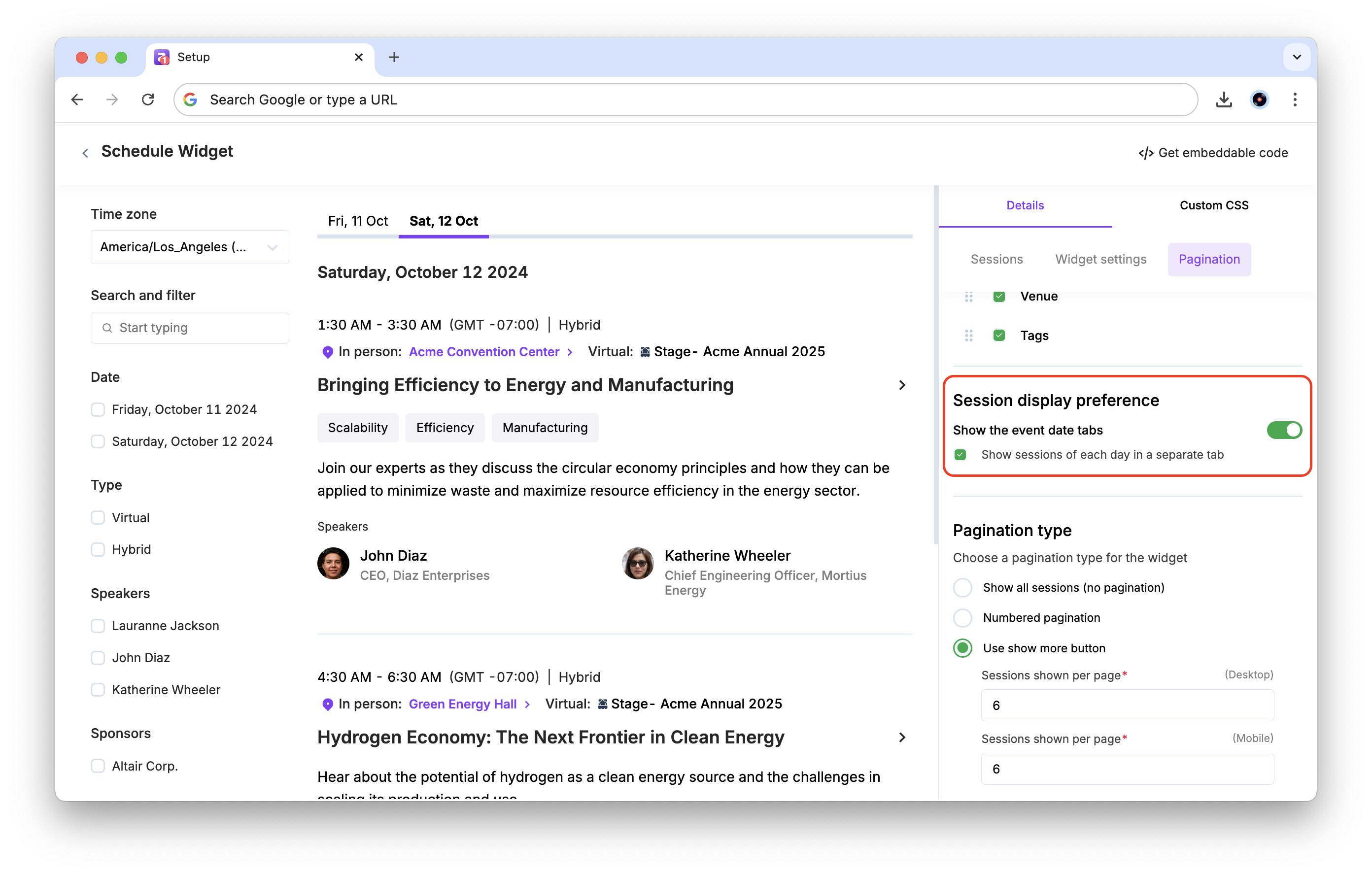
Choose a pagination type for the widget:
Show all sessions (no pagination): This shows all sessions in a continuous scroll
Numbered pagination: This shows a fixed number of sessions per page, and you can customize the number of Sessions shown per page separately for desktop and mobile.
Use show more button: This allows attendees to click on a button to show all sessions.
Sessions shown per page (Mobile/Desktop): The number of sessions shown per view. Defaults to 6. Enter a specific number for Mobile or Desktop.
Customize widget branding
To customize your branding,
After customizing the sessions and details to display, click the Custom CSS tab in the sidebar.
In the code text area on the right, you can enter your custom CSS code to customize the widget's appearance.
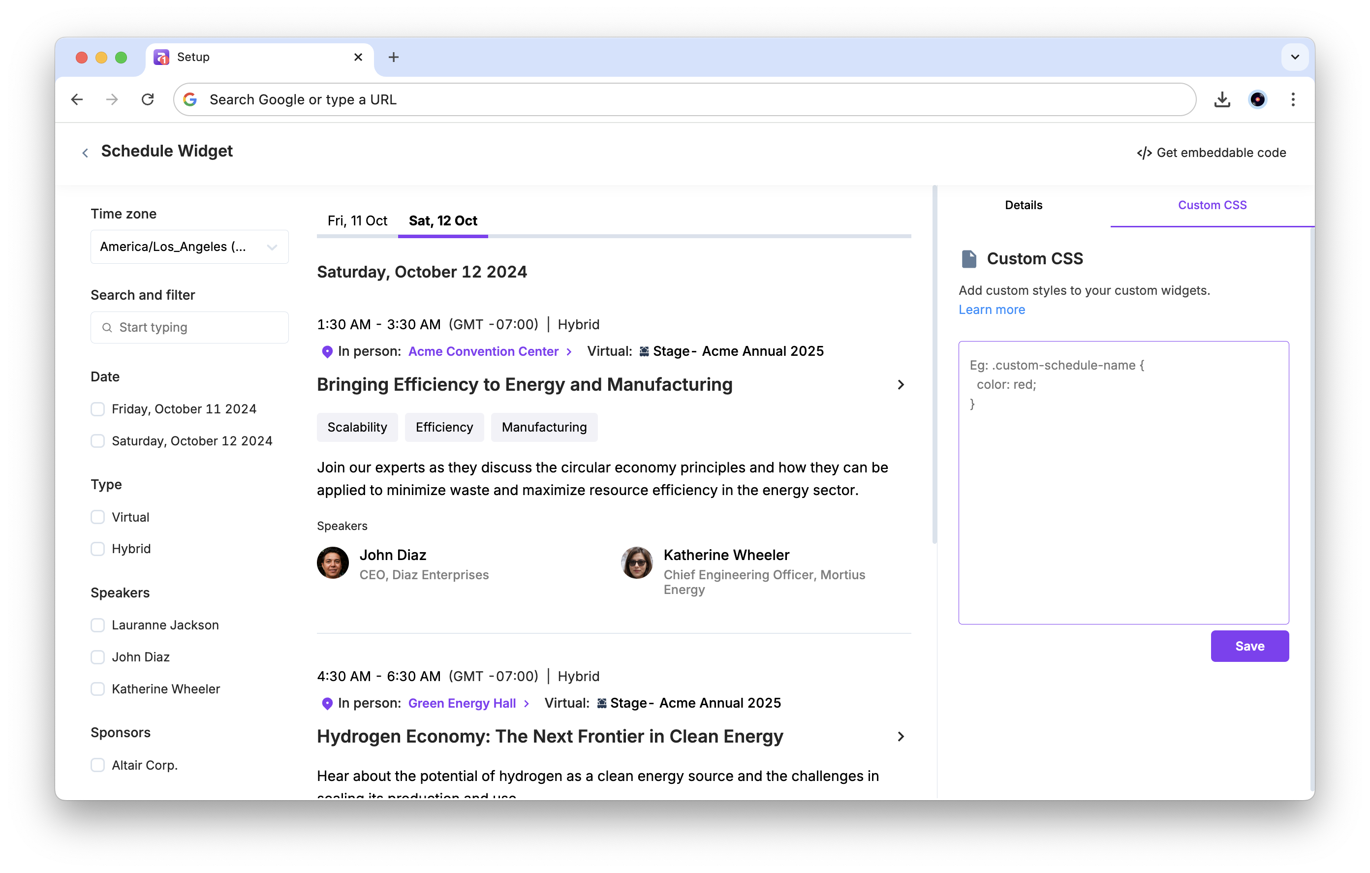
Click Save.
CSS classes for the widget
Currently, you can use the following classes to style the Schedule widget:
Session card Classes
Class name | Description |
custom-schedule-name | Represents the title text of a session or presentation displayed on the session card. |
custom-schedule-time | Represents the start and end time displayed for each session on the schedule. |
custom-schedule-time-zone | Represents the time zone label shown alongside the session time (e.g., "PST", "EST"). |
custom-schedule-session-format | Represents the badge indicating the session format, such as Virtual, In-Person, or Hybrid. |
custom-schedule-description | Represents the summary or description text displayed below the session title. |
custom-schedule-background | Represents the background container or card wrapper of each session entry. |
custom-schedule-venue | Represents the venue or location name text displayed on the session card. |
custom-schedule-venue-icon | Represents the map pin icon shown next to the venue name. |
custom-schedule-divider | Represents the horizontal line separator between different elements within a session card. |
Speaker Elements
Class name | Description |
custom-schedule-speaker-avatar | Represents the profile image or avatar of a speaker shown on the session card. |
custom-schedule-speaker-name | Represents the name text of a speaker displayed on the session card. |
custom-schedule-speaker-title | Represents the job title or designation of a speaker shown on the session card. |
Sponsor Elements
Class name | Description |
custom-schedule-sponsor-avatar | Represents the logo image of a sponsor displayed on the session card. |
custom-schedule-sponsor-name | Represents the company name of a sponsor shown on the session card. |
custom-schedule-sponsor-title | Represents the designation or tier label of a sponsor on the session card. |
Tags & Labels
Class name | Description |
custom-schedule-tag | Represents the tag or category label attached to a session (e.g., "Keynote", "Workshop"). |
custom-schedule-file | Represents the icon or label for files and resources attached to a session. |
Actions & Buttons
Class name | Description |
custom-schedule-add-to-calendar-icon | Represents the icon for the "Add to Calendar" action button on a session card. |
custom-schedule-view-details-icon | Represents the icon for the "View Details" action button on a session card. |
custom-schedule-reserve-spot-button | Represents the "Reserve Spot" or RSVP button that allows attendees to book a seat for a session. |
custom-schedule-spots-left-text | Represents the text showing the number of remaining spots available for a session. |
custom-schedule-watch-recording-button | Represents the "Watch Recording" button displayed on past sessions that have a recording available. |
Navigation & Filters
Class name | Description |
custom-schedule-date-selector | Represents the dropdown button used to select a specific date on the schedule. |
custom-schedule-date-button-text | Represents the text label inside the date selector dropdown button. |
custom-schedule-date-dropdown | Represents the dropdown menu container that appears when the date selector is clicked. |
custom-schedule-date-dropdown-title | Represents the title text displayed at the top of the date dropdown menu. |
custom-schedule-date-title | Represents the heading text showing the currently selected or active date. |
custom-schedule-search | Represents the search input field used to search for sessions by keyword. |
custom-schedule-tab | Represents the tab navigation buttons such as "All Sessions" and "My Schedule". |
custom-schedule-selected-tab | Represents the currently active or selected tab in the schedule navigation. |
custom-schedule-filters | Represents the container that holds all filter options for narrowing down sessions. |
custom-schedule-filter-icons | Represents the toggle icons used to open or close the filter panel. |
custom-schedule-filter-title | Represents the main heading text of a filter section (e.g., "Filter by Track"). |
custom-schedule-filter-sub-title | Represents the subheading text within a filter section. |
custom-schedule-filter-options | Represents an individual filter option item within a filter section. |
custom-schedule-filter-options-container | Represents the container that holds the list of filter option items. |
custom-schedule-filter-see-more-options-container | Represents the expanded view container that shows additional filter options. |
custom-schedule-filter-see-more-apply-button | Represents the "Apply" button used to confirm and apply the selected filters. |
Pagination
Class name | Description |
custom-schedule-numbered-pagination | Represents the numbered page navigation controls at the bottom of the schedule list. |
custom-schedule-see-more-pagination | Represents the "See More" button used to load additional sessions in the list. |
Presentation View
Class name | Description |
custom-schedule-back-to-sessions | Represents the "Back to Sessions" link that navigates back to the full session list from the detail view. |
custom-schedule-presentation-name | Represents the title of a presentation displayed in the session detail view. |
custom-schedule-presentation-time | Represents the start and end time of a presentation in the session detail view. |
custom-schedule-presentation-time-zone | Represents the time zone label shown in the presentation detail view. |
custom-schedule-presentation-session-format | Represents the session format badge (Virtual/In-Person/Hybrid) in the presentation detail view. |
custom-schedule-presentation-tag | Represents the tag or category label displayed in the presentation detail view. |
custom-schedule-presentation-speaker-name | Represents the speaker name text displayed in the presentation detail view. |
custom-schedule-presentation-speaker-title | Represents the speaker job title or designation in the presentation detail view. |
custom-schedule-presentation-speaker-avatar | Represents the speaker profile image displayed in the presentation detail view. |
Speaker Details Modal
Class name | Description |
custom-schedule-speaker-details-modal-container | Represents the outermost container of the speaker details popup modal. |
custom-schedule-speaker-details-modal-main-content | Represents the main content area inside the speaker details modal. |
custom-schedule-speaker-details-modal-header | Represents the header section at the top of the speaker details modal. |
custom-schedule-speaker-details-modal-header-details | Represents the speaker information block within the modal header (name, title, avatar). |
custom-schedule-speaker-details-modal-speaker-avatar | Represents the speaker profile image displayed inside the speaker details modal. |
custom-schedule-speaker-details-modal-speaker-name | Represents the speaker name text displayed inside the speaker details modal. |
custom-schedule-speaker-details-modal-speaker-title | Represents the speaker job title or designation inside the speaker details modal. |
custom-schedule-speaker-details-modal-speaker-bio-with-about-title | Represents the speaker biography text along with the "About" heading inside the modal. |
custom-schedule-speaker-details-modal-background | Represents the background overlay displayed behind the speaker details modal. |
custom-schedule-speaker-details-modal-social-container | Represents the container holding the speaker's social media links inside the modal. |
custom-schedule-speaker-details-modal-speaker-social-icons | Represents the group of social media icons (LinkedIn, Twitter, etc.) inside the speaker modal. |
custom-schedule-speaker-details-modal-close-icon | Represents the close (X) icon used to dismiss the speaker details modal. |
custom-schedule-speaker-details-modal-close-container | Represents the clickable container wrapping the close icon in the speaker details modal. |
custom-schedule-speaker-details-modal-about-section | Represents the "About" section container inside the speaker details modal. |
custom-schedule-speaker-details-modal-about-title | Represents the "About" heading text inside the speaker details modal. |
custom-schedule-speaker-details-modal-divider | Represents the horizontal separator line inside the speaker details modal. |
custom-schedule-speaker-details-modal-sessions-container | Represents the container listing all sessions associated with the speaker inside the modal. |
custom-schedule-speaker-details-modal-sessions-title | Represents the "Sessions" heading text inside the speaker details modal. |
Sponsor Details Modal
Class name | Description |
custom-schedule-sponsor-details-modal-sponsor-avatar | Represents the sponsor logo image displayed inside the sponsor details modal. |
custom-schedule-sponsor-details-modal-sponsor-name | Represents the sponsor company name text inside the sponsor details modal. |
custom-schedule-sponsor-details-modal-sponsor-title | Represents the sponsor designation or tier label inside the sponsor details modal. |
custom-schedule-sponsor-details-modal-sponsor-email | Represents the sponsor email address displayed inside the sponsor details modal. |
custom-schedule-sponsor-details-modal-sponsor-bio-with-about-title | Represents the sponsor biography text along with the "About" heading inside the modal. |
custom-schedule-sponsor-details-modal-background | Represents the background overlay displayed behind the sponsor details modal. |
custom-schedule-sponsor-details-modal-sponsor-social-icons | Represents the group of social media icons displayed inside the sponsor details modal. |
custom-schedule-sponsor-details-modal-close-icon | Represents the close (X) icon used to dismiss the sponsor details modal. |
You can also contact our support team (support@zuddl.com) for further assistance.
Best practices
You cannot inspect the page and use any classes given as it may not give you the intended results. Use only Zuddl custom classes listed for branding customizations.
Add "!important" on properties that aren't behaving as expected, which may be because of any existing class. This tag will give precedence to the CSS
Embed the schedule widget
To embed the schedule widget,
Click on the </> Get embeddable code icon to view the embeddable link.
Click on the Copy button.

Paste the code in your HTML webpage inside the <body> tag.
The schedule widget will be visible to visitors viewing the website. Any updates to your schedule will automatically be reflected in the schedule widget.