Category / Section
How to Create Add-ons for a Virtual Event in Zuddl
Published:
38 mins read
Updated:
You can add custom CSS styles to each step in the registration process using the flow branding option and customize your registration page as per your company's branding guidelines. You can customize a few additional pages, such as the error or the loading page.
Note: This article is intended to be used by CSS developers as it contains CSS concepts and terminologies.
Customize flow branding
To customize your branding,
After you've finished creating a registration flow, click on the more option (three dots) at the top and then click on Flow branding.
This redirects you to the Branding page, where you can add your CSS code. A two-pane window shows a CSS code area on the right and a preview area on the left.
Select the desired step from the dropdown. Each step you create in the flow-building process appears as a dropdown menu here.
Note: In addition to the steps in your flow, you can select the Error or Loading page to preview the customization.
- On the code text area on the right, you can customize the CSS styles.
Using CSS classes to style the pages
The following sections show the different classes and their components which you can use.
Important guidelines
- You cannot inspect the page and use any classes given as it may not give you the intended results. Use only Zuddl custom classes listed for branding customizations.
- Add !important on properties that aren’t behaving as expected maybe because of any existing class. This tag will give precedence to the CSS.
- For iOS devices, any input should have a minimum font size of 16px because if the selected input is below 16px, iOS automatically zooms in and stays in the zoomed-in mode.
- You can refer to specific tags or elements within a class, for example, ‘span’, ‘p’. See the example below of referring to tags within a loading page class.
.LoadingPage__icons span { background-color: #445b4b !important; }
- Do not use <style> tags in the Custom CSS text area
- The feature only supports plain CSS and not CSS nesting
- Payment fields cannot be branded
- Disclaimer text should be 14px. Increasing the text may disturb the alignment of checkbox with text
- Because not everything can be seen in the preview, you can preview the actual flow on your landing page after you have worked on the styles.
You can reach out to our support team (support@zuddl.com) for any further assistance.
Main container
Class names | Description |
---|---|
Flow__main-container | Represents the main container for a flow. |
Adding custom fonts
To add custom fonts for global use across all properties, specify the font CSS url inside the ‘@import url’ tag and use the font-family in ‘Flow__main-container’ as shown below:
@import url('https://fonts.googleapis.com/css2?family=Roboto+Mono:wght@400;600;700&display=swap'); .Flow__main-container * { font-family: 'Roboto Mono', monospace; }
Adding custom background color
By default, the container is transparent but you can change the background color of the entire flow as shown below:
.Flow__main-container { background-color: #ebd9e1!important; }
Form
Class names | Description |
---|---|
Form__heading | Represents the heading in a form. |
Form__label | Describes labels in a form. |
Form__input | Represents input fields in a form. |
Form__error | Indicates error messages in a form. |
Form__rich-text | Describes rich text elements in a form. |
Form__disclaimer | Represents disclaimers in a form. |
Form__button | Describes buttons in a form. |
Form__button-text | Represents the text of buttons in a form. |
Form__breadcrumb-not-selected | Indicates breadcrumb items that are not selected. |
Form__breadcrumb-selected | Represents breadcrumb items that are selected. |
Form__breadcrumb-text | Describes the text of breadcrumb items. |
Form__breadcrumb-arrow | Represents arrows in breadcrumb items. |
Form__main-container | Describes the main container in a form. |
Instead of individually defining color for each component in the CSS code, you can override the variable colors as shown below:
.Flow__main-container * { --primary: 247,167,13; --primary-hover: 237, 167, 13; --danger: 229,29,63; --danger-hover: 201,26,55; --text-medium: 255,255,255, 0.90; --text-high: 255, 255, 255; --mono-base: 0,0,0; --base-1: 0,0,0,0.25 }
Class names | Description |
---|---|
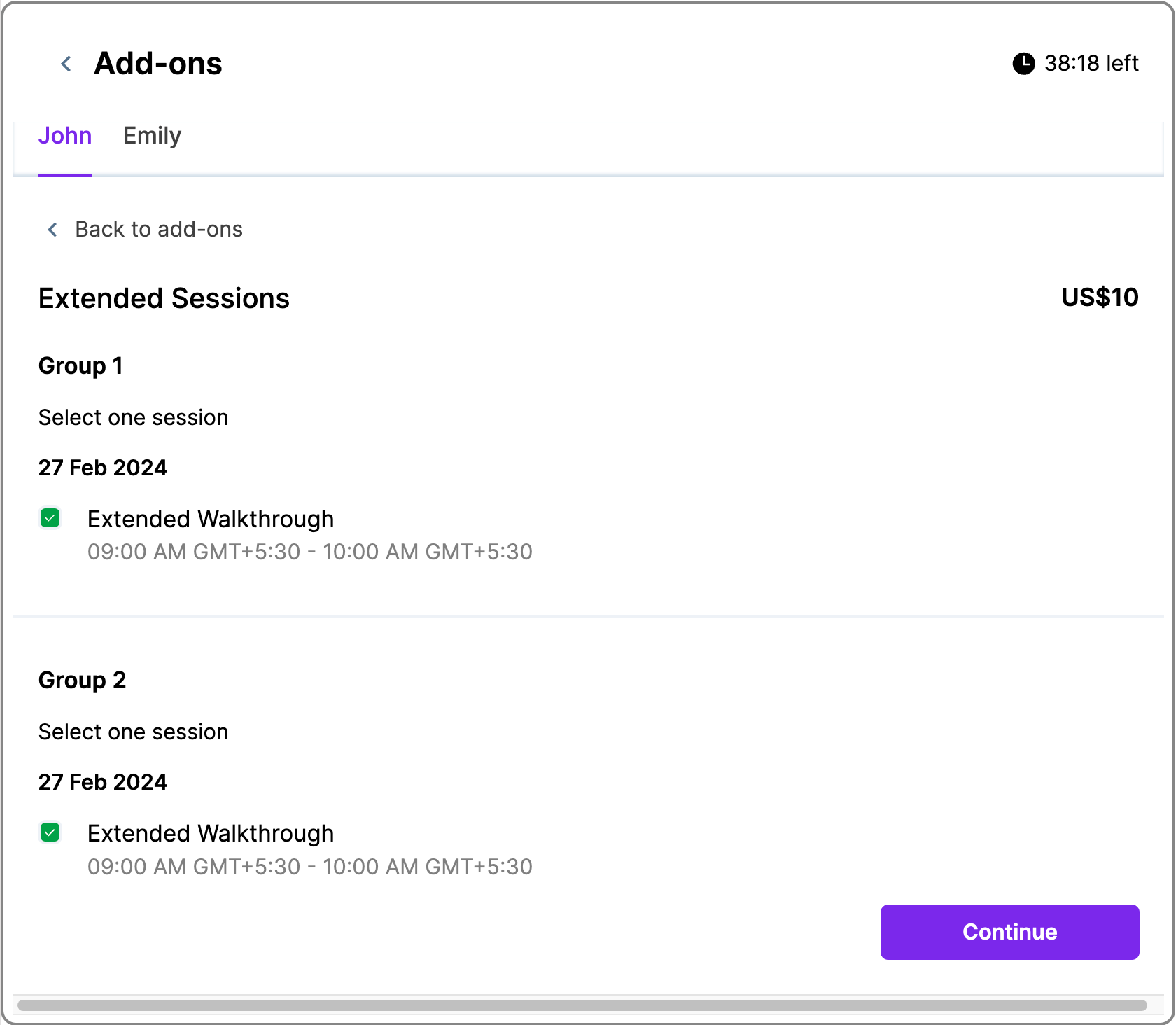
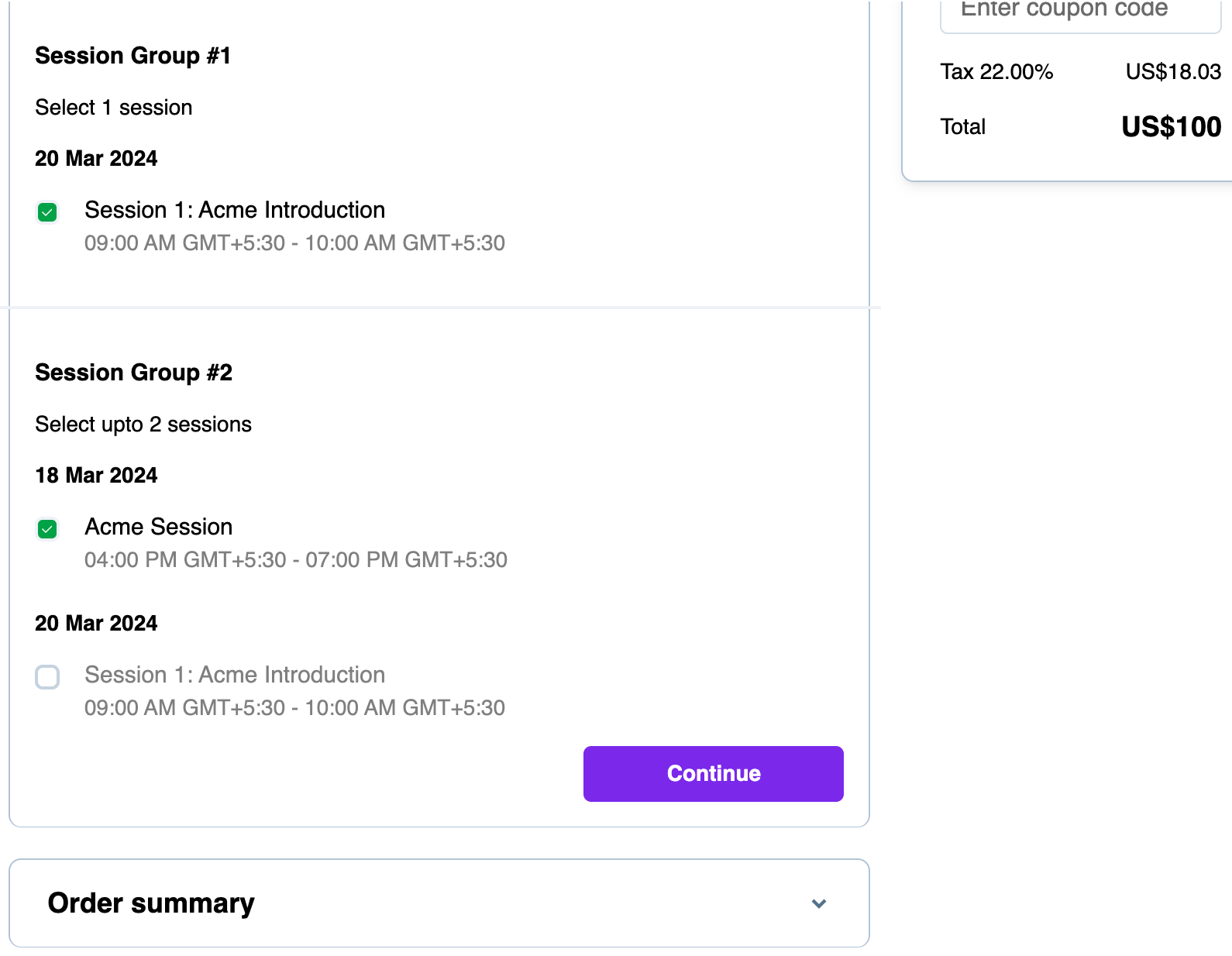
SessionPickerField__session-picker-field | Represents the specific field within the session picker where sessions can be selected. |
SessionPickerField__session-group-name | Represents the name of a group of sessions within the session picker. |
SessionPickerField__condition-label | Represents a label that indicates specific conditions related to the sessions. |
SessionPickerField__session-day | Represents the display element for the day of the session. |
SessionPickerField__session-item | Represents an individual session item within the session picker. |
SessionPickerField__session-name | Represents the display element for the name of the session. |
SessionPickerField__session-time | Represents the display element for the time of the session. |
SessionPickerField__remove-session-button | Represents the button to remove a selected session. |
SessionPickerField__remove-session-button_text | Represents the text inside the remove session button. |
SessionPickerField__selected-icon | Represents an icon indicating a selected session. |
SessionPickerField__select-session-button | Represents the button to select a session. |
SessionPickerField__select-session-button_text | Represents the text inside the select session button. |
SessionPickerField__session-full-button | Represents the button indicating a session is full. |
SessionPickerField__session-full-button-text | Represents the text inside the session full button. |
Color variables
Variable names | Description |
---|---|
--primary | Accepts RGB value. Defines the primary color of the entire flow. Defaults to the event's primary color. |
-—primary-hover | Accepts RGB value. Defines the hover color on all primary elements of the entire flow. |
-—danger | Defines the color of Edit detail button in the modify registration flow. Also used for error message texts. |
-—danger-hover | Defines the hover color on the Edit detail button in the modify registration flow. |
-—text-high | Defines the primary text color of the flow |
-—text-medium | Defines Secondary text color of the flow |
-—mono-base | Represents the background color of modals and dropdown menu lists. Note: This variable may be used for other components. |
-—base-1 | Represents the hover color of the accordion headers. Note: This variable may be used for other components. |
Ticket
Class names | Description |
---|---|
Ticket__heading | Represents the heading for a ticket. |
Ticket__title | Describes the title of a ticket. |
Ticket__description | Represents the description of a ticket. |
Ticket__price | Indicates the price of a ticket. |
Ticket__regular-price | Represents the regular price of a ticket. |
Ticket__badge | Describes the badge associated with a ticket. |
Ticket__error-message | Represents an error message related to a ticket. |
Ticket__container | Represents the container for a ticket. |
Ticket__main-container | Describes the main container for a ticket. |
Ticket__have-a-coupon | Shows the ‘Have a coupon code?’ element. Only shown in mobile view. |
Ticket__applicable-coupon | Represents the applicable coupon label on ticket types. You can also add a ‘p’ tag to style the label text. |
Ticket__locked-ticket | Represents the locked ticket icon and label |
Ticket__locked-ticket-tooltip | Represents locked ticket tooltip |
The sample CSS code below shows how Ticket coupon classes can be used:
// This example is for styling the coupon icon only in Mobile view of the Ticketing step .Ticket__have-a-coupon svg { fill: #f7a70d !important; } // This example is for styling the applicable coupon label container .Ticket__applicable-coupon { background-color: rgb(247,167,13,0.12) !important; } // This example is for styling the applicable coupon label text .Ticket__applicable-coupon p { color: #f7a70d !important; }
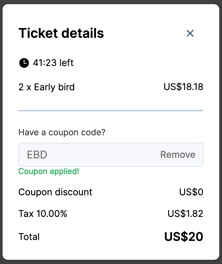
Ticket Cart
Class name | Description |
---|---|
TicketCart__heading | Represents the heading in a ticket cart. |
TicketCart__title | Describes the title in a ticket cart. |
TicketCart__price | Indicates the price in a ticket cart. |
TicketCart__coupon-success | Represents a coupon success message in a ticket cart. |
TicketCart__coupon-error | Indicates a coupon error message in a ticket cart. |
TicketCart__apply-code-button | Represents the button for applying a code within the ticket cart. |
TicketCart__apply-code-button-text | Represents the text within the apply code button in the ticket cart. |
TicketCart__remove-code-button | Represents the button to remove a coupon code in a ticket cart. |
TicketCart__remove-code-button-text | Represents the text within the remove code button in the ticket cart |
TicketCart__discount-text | Describes the discount text in a ticket cart. |
TicketCart__discount-value | Indicates the discount value in a ticket cart. |
TicketCart__tax-text | Describes the tax text in a ticket cart. |
TicketCart__tax-value | Indicates the tax value in a ticket cart. |
TicketCart__total-price | Represents the total price in a ticket cart. |
TicketCart__button | Describes buttons in a ticket cart. |
TicketCart__button-text | Represents the text of buttons in a ticket cart. |
TicketCart__total-text | Describes the total text in a ticket cart. |
TicketCart__edit-details | Indicates the option to edit details in a ticket cart. |
Timer
Class name | Description |
---|---|
Timer__clock | Represents the clock element in a timer. |
Timer__time | Describes the time displayed in a timer. |
Accordion
Class names | Description |
---|---|
OrderSummary__heading | Represents the heading in Order Summary. |
OrderSummary__sub-heading | Describes subheadings in Order Summary. |
OrderSummary__edit-details | Indicates the option to edit details in Order Summary. |
OrderSummary__label | Describes labels in Order Summary. |
OrderSummary__value | Indicates values in Order Summary. |
OrderSummary__button | Represents buttons in Order Summary. |
OrderSummary__button-text | Describes the text of buttons in Order Summary. |
Accordion__container | Represents the container in an accordion. |
Accordion__main-container | Describes the main container in an accordion. |
Loading page
Class names | Description |
---|---|
LoadingPage__heading | Represents the heading on a loading page. |
LoadingPage__sub-heading | Describes subheadings on a loading page. |
LoadingPage__icons | Represents icons on a loading page. |
LoadingPage__main-container | Describes the main container on a loading page. |
Error page
Class names | Description |
---|---|
ErrorPage__heading | Represents the heading on an error page. |
ErrorPage__sub-heading | Describes subheadings on an error page. |
ErrorPage__icon | Represents icons on an error page. |
ErrorPage__button | Describes buttons on an error page. |
ErrorPage__button-text | Represents the text of buttons on an error page. |
ErrorPage__main-container | Describes the main container on an error page. |
Thank you page
Class names | Description |
---|---|
ThankYou__heading | Represents the heading on a Thank you page. |
ThankYou__sub-heading | Describes subheadings on a thank-you page. |
ThankYou__bottom-section | Represents the bottom section of the Thank You page. |
ThankYou__transaction-heading | Represents the transaction heading on a thank-you page. |
ThankYou__transaction-id | Indicates the transaction ID on a thank-you page. |
ThankYou__copy-icon | Represents the copy icon on a thank-you page. |
ThankYou__registration-details | Describes the registration details section on a thank-you page. |
ThankYou__edit-details-button | Represents the edit details button on a thank-you page. |
ThankYou__edit-details-button-text | Describe the text of the edit details button on a thank-you page. |
ThankYou__ticket-name | Represents the name of a ticket on a thank-you page. |
ThankYou__ticket-total-amount | Indicates the total amount of a ticket on a thank-you page. |
ThankYou__resend-button | Represents the resend button on a thank-you page. |
ThankYou__resend-button-text | Describes the text of the resend button on a thank-you page. |
ThankYou__download-button | Represents the download button on a thank-you page. |
ThankYou__download-button-text | Describes the text of the download button on a thank-you page. |
ThankYou__attendee-details-heading | Describes the heading for attendee details on a thank-you page. |
ThankYou__attendee-list | Represents the list of attendees on a thank-you page. |
ThankYou__attendee-name | Describes the name of an attendee on a thank-you page |
ThankYou__attendee-email | Indicates the email of an attendee on a thank-you page. |
ThankYou__main-container | Represents the main container on a thank-you page. |
Button
Class names | Description |
---|---|
Button__base | Represents the base style of a button. |
Button__base-text | Describes the text style of a button. |
Button__primary | Represents the primary style of a button. |
Button__primary-text | Describes the text style of a primary button. |
Button__secondary | Represents the secondary style of a button. |
Button__secondary-text | Describes the text style of a secondary button. |
Button__tertiary | Represents the tertiary style of a button. |
Button__tertiary-text | Describes the text style of a tertiary button. |
Styling a button
The below example shows a button with styles applied.
.Button__primary { background-color: #445b4b !important; width: 160px; height: 48px; border-radius: 0px; text-transform: uppercase; font-weight: 700; } .Button__primary:hover { background-color: green !important; }
Note: You can use psuedo class such as ’hover’ with a Zuddl class.
Dropdown
Class names | Description |
---|---|
Dropdown__single-value | Represents the styling for the single selected value displayed in the dropdown when it is closed. This is typically the value displayed before the user opens the dropdown to make a selection. |
Dropdown__multi-value | Used to style the selected values in a multi-select dropdown. It applies to the elements that display multiple selected values within the dropdown. |
Dropdown__control | Associated with the control container of the dropdown, which typically includes the input field and the dropdown toggle button. Styling this class can help control the appearance of these elements. |
Dropdown__input-container | Used to style the container that holds the input element within the dropdown. It can be useful for controlling the styling of the input area, such as borders, backgrounds, or padding. |
Dropdown__indicator | Pertains to the indicator icon(s) within the dropdown, such as the arrow icon that indicates whether the dropdown is open or closed. Styling this class can affect the appearance of these indicator icons. |
Dropdown__menu | Associated with the dropdown menu that appears when the user opens the dropdown. It includes all the available options for selection. Styling this class can help customize the appearance of the dropdown menu. |
Dropdown__menu-list | Represents the list of options within the dropdown menu. It's used to style the individual items or options that the user can select from. You can use it to control the appearance of each option. |
Dropdown__option | Applied to each individual option within the dropdown menu. You can use it to style each option item differently if needed, allowing for fine-grained control over the appearance of the selectable items. |
Dropdown__option--is-focused | Often used to style the currently focused option within the dropdown menu. It helps indicate which option is selected using keyboard navigation. |
Dropdown__option--is-selected | Applied to an option that is selected by the user. It allows you to style selected options differently from unselected options. |
Dropdown__option--is-disabled | When an option is disabled and cannot be selected, this class can be applied to style it differently, typically with a different color or style to indicate its disabled state. |
Dropdown__placeholder | Represents the styling for the placeholder text that is displayed in the input field when no option is selected. You can use it to control the appearance of the placeholder text. |
Bulk classes
Class names | Description |
---|---|
BulkRegistration__container | Represents the container for bulk registration. |
BulkRegistration__mobile-container | Represents the mobile container for bulk registration |
BulkRegistration__selected | Represents items that are selected in bulk registration. |
BulkRegistration__not-selected | Indicates items that are not selected in bulk registration. |
BulkRegistration__selected-in-mobile | Represents items that are selected in mobile view in bulk registration. |
BulkRegistration__not-selected-in-mobile | Indicates items that are not selected in mobile view in bulk registration. |
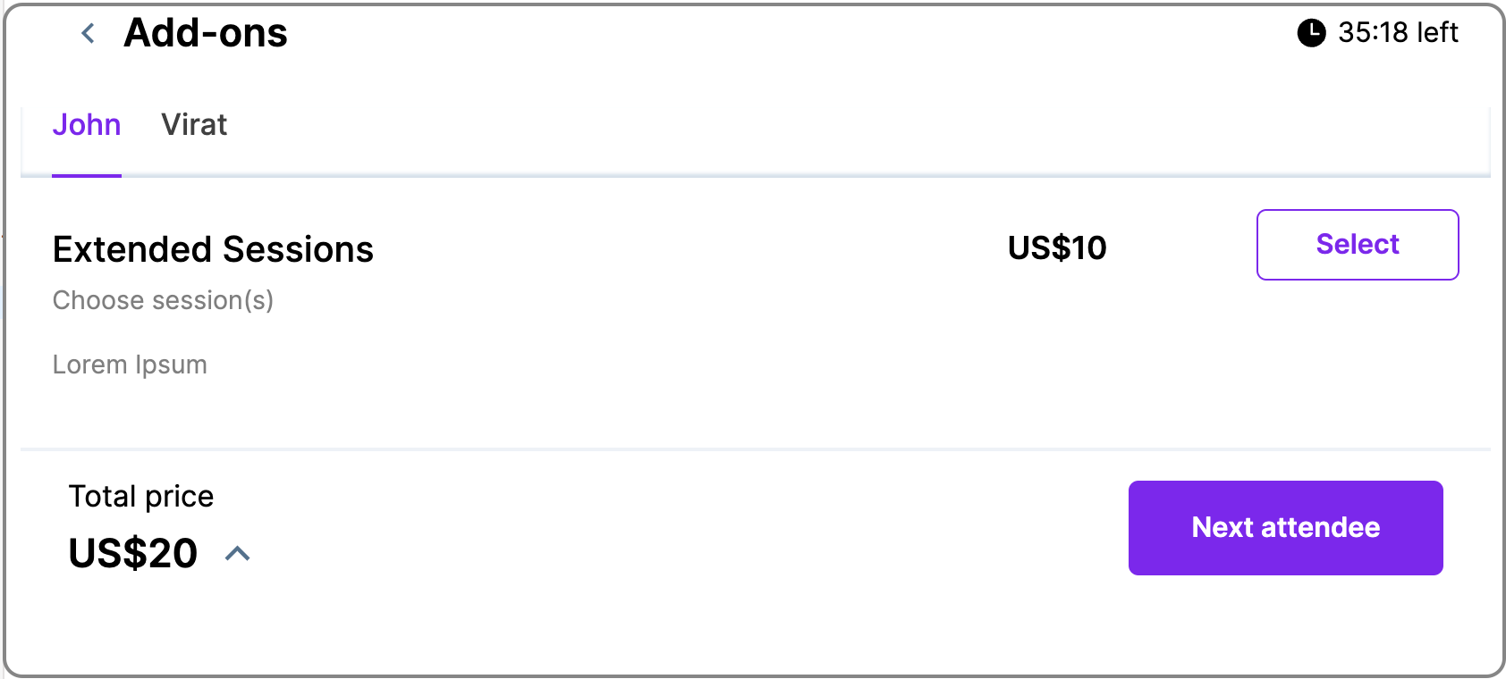
Mobile Footer
Class name | Description |
---|---|
MobileFooter__container | Represents the container for the mobile footer. |
MobileFooter__heading | Describes the heading in the mobile footer. |
MobileFooter__price | Indicates the price in the mobile footer. |
MobileFooter__button | Represents buttons in the mobile footer. |
MobileFooter__button-text | Describes the text of buttons in the mobile footer. |
MobileFooter__up-arrow | Represents the up arrow in the mobile footer. |
Edit Registrations
Class name | Description |
---|---|
EditRegistration__main-container | Represents the main container in the edit registration page. |
EditRegistration__header | Describes the header in the edit registration page. |
EditRegistration__logo | Represents the logo in the edit registration page. |
EditRegistration__heading | Describes the heading in the edit registration page. |
EditRegistration__sub-heading | Indicates subheadings in the edit registration page. |
EditRegistration__card | Represents cards in the edit registration page. |
EditRegistration__card-heading | Describes the heading of a card in the edit registration page. |
EditRegistration__card-label | Indicates labels on a card in the edit registration page. |
EditRegistration__card-value | Describes values on a card in the edit registration page. |
EditRegistration__edit-button | Represents the edit button in the edit registration page. |
EditRegistration__edit-button-text | Describes the text of the edit button in the edit registration page. |
EditRegistration__modal-container | Represents the modal container in the edit registration page. |
EditRegistration__attendee | Describes attendees in the edit registration page. |
EditRegistration__modal-heading | Represents the modal heading in the edit registration page. |
EditRegistration__modal-button | Describes buttons in the modal in the edit registration page. |
EditRegistration__modal-button-text | Represents the text of buttons in the modal in the edit registration page. |