Understanding App Rejections
Last updated: August 1, 2025
In the process of submitting an app to the store (Apple App Store and Google Play Store), it's essential to adhere to specific guidelines to ensure a smooth approval process. In this doc, we outline the most common reasons for app rejections and provide valuable insights to mitigate such occurrences.
Safety
Apps must maintain a standard of safety by refraining from including offensive, insensitive, or disturbing content. Content intended to disgust or that exhibits exceptionally poor taste will lead to rejection.
Performance
Accurate metadata is crucial. All app metadata, including privacy information, descriptions, screenshots, and previews, must truthfully represent the app's core functionality. Avoid hidden, dormant, or undocumented features. Screenshots should actively showcase the app's usage and features rather than solely displaying title art or splash screens. Ensure the app name is unique, and avoid stuffing metadata with irrelevant phrases or trademarked terms.
Business
Design plays a pivotal role in app acceptance. Apps should offer features, content, and UI elements that differentiate them from mere replications of websites. If an app lacks uniqueness or utility, it may not meet App Store standards.
General Considerations
- Completion: Ensure the app is nearly 90% complete before submission. Incomplete content or inadequate data across multiple pages can lead to rejection.
- Screenshots: Aim for at least four pages within the app that demonstrate its usefulness through rich text, images, CTAs, or FAQ pages. These screenshots are vital for showcasing the app's functionality on the store.
- Avoid Changes: Refrain from making any alterations to the app during the review process. The App Store uses provided credentials for assessment and approval. Obtain prior permission from PMs/Dev teams for any necessary changes.
- Display: The primary color scheme of the app should offer sufficient contrast to the theme set. This is essential to prevent automated or manual reviews from identifying buttons as unresponsive due to inadequate color contrast.
By adhering to these guidelines and maintaining vigilance throughout the submission process, developers can minimize the risk of app rejection and ensure a smoother experience in getting their apps approved on the store.
Some examples
Attaching below examples of app rejections -
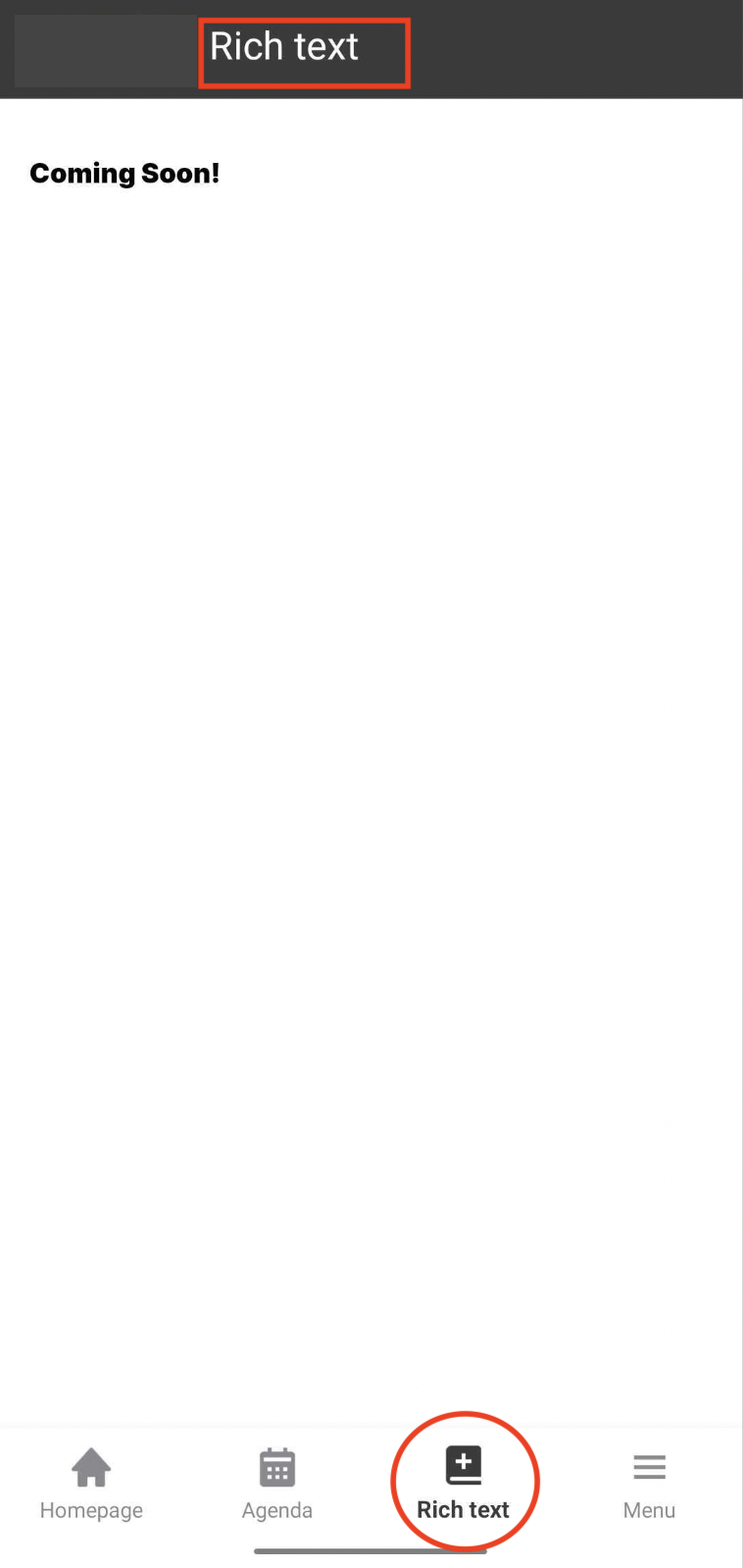
- Naming App Pages Appropriately - When naming app pages, it's crucial to choose labels that accurately reflect the content and purpose of each page. Appropriate naming not only enhances user understanding but also ensures compliance with store guidelines.
- Ensuring Contrast for Primary Colors in App Design Maintaining adequate contrast between the primary colors used in an app and its overall theme is crucial for accessibility and user experience. When primary colors blend into the background or fail to stand out, it can lead to usability issues and potential app rejection.
In the example below, the ‘agenda’ icon becomes indistinguishable from the background when clicked, it could confuse users and compromise the app's functionality.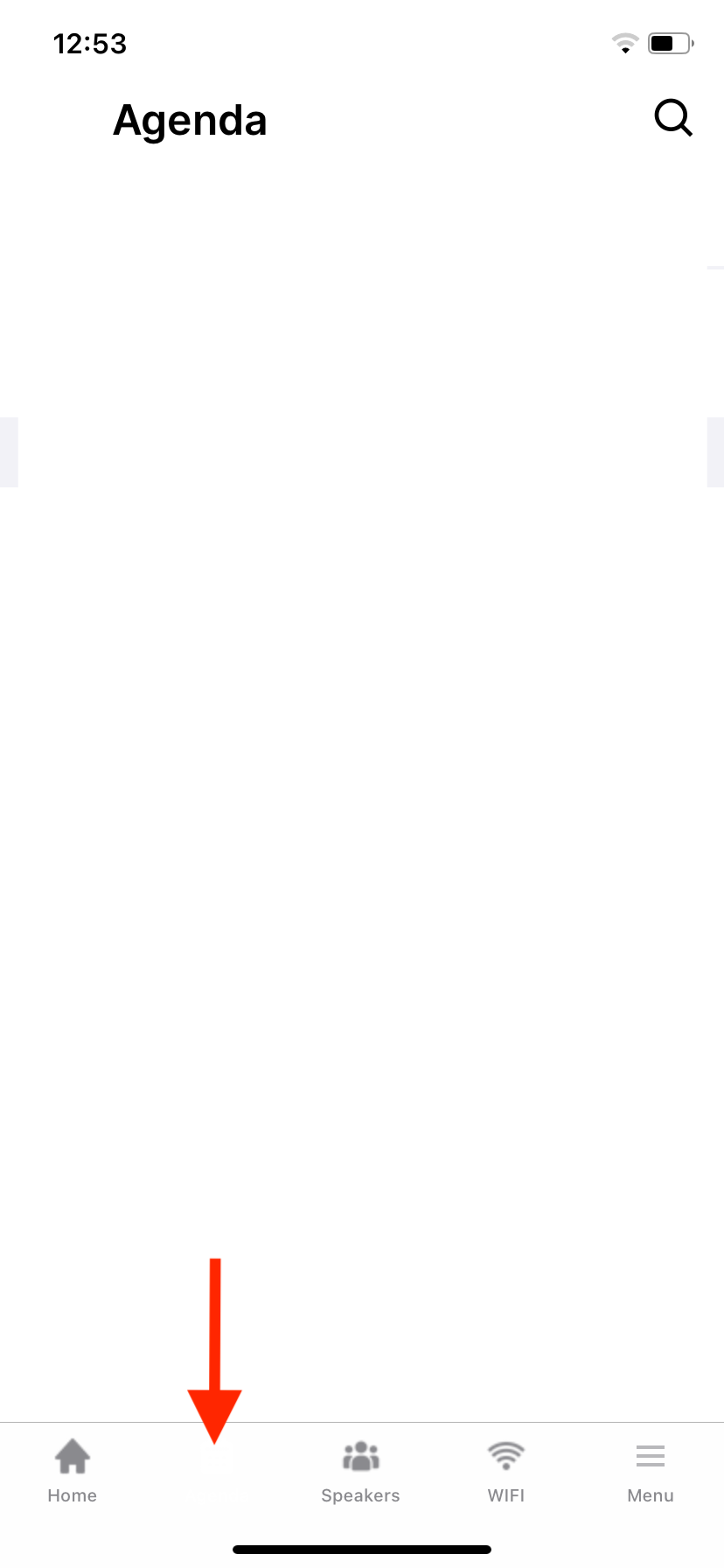
- Enhancing Button Visibility to Prevent Unresponsiveness - During app reviews, both automated bots and manual reviewers assess various aspects of app functionality, including button responsiveness. It's crucial to ensure that button colors do not blend into the background or resemble disabled button states, typically represented by gray tones. When buttons appear indistinguishable or mimic inactive states, they may be perceived as unresponsive, potentially leading to rejection.