How to Customize the Sponsor Widget for a Hybrid Event in Zuddl
Last updated: August 1, 2025
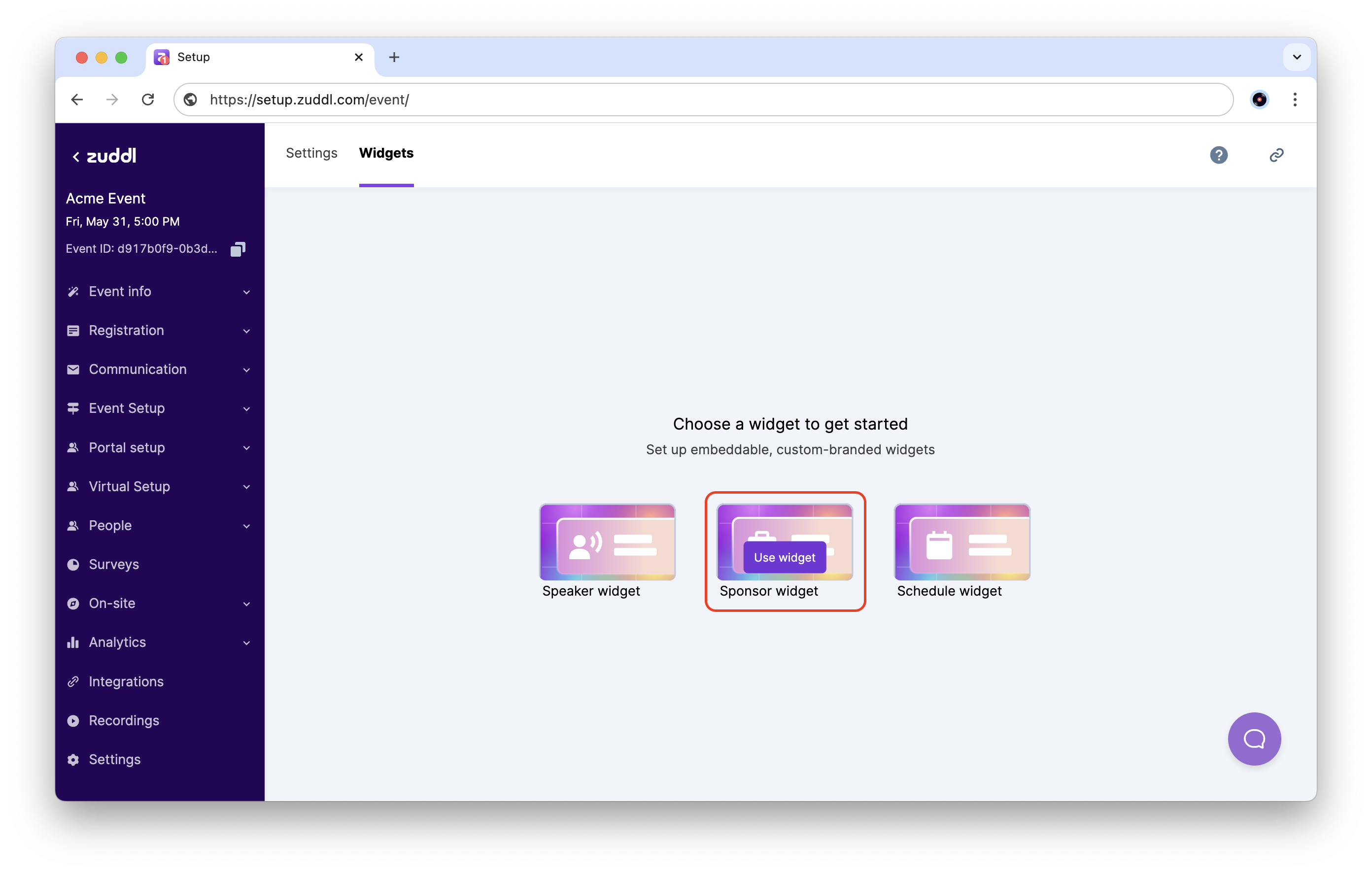
- Go to Settings > Widgets. On Sponsor widget, click the Use widget button.
- Here you can see the sponsors listed and sorted according to tiers.
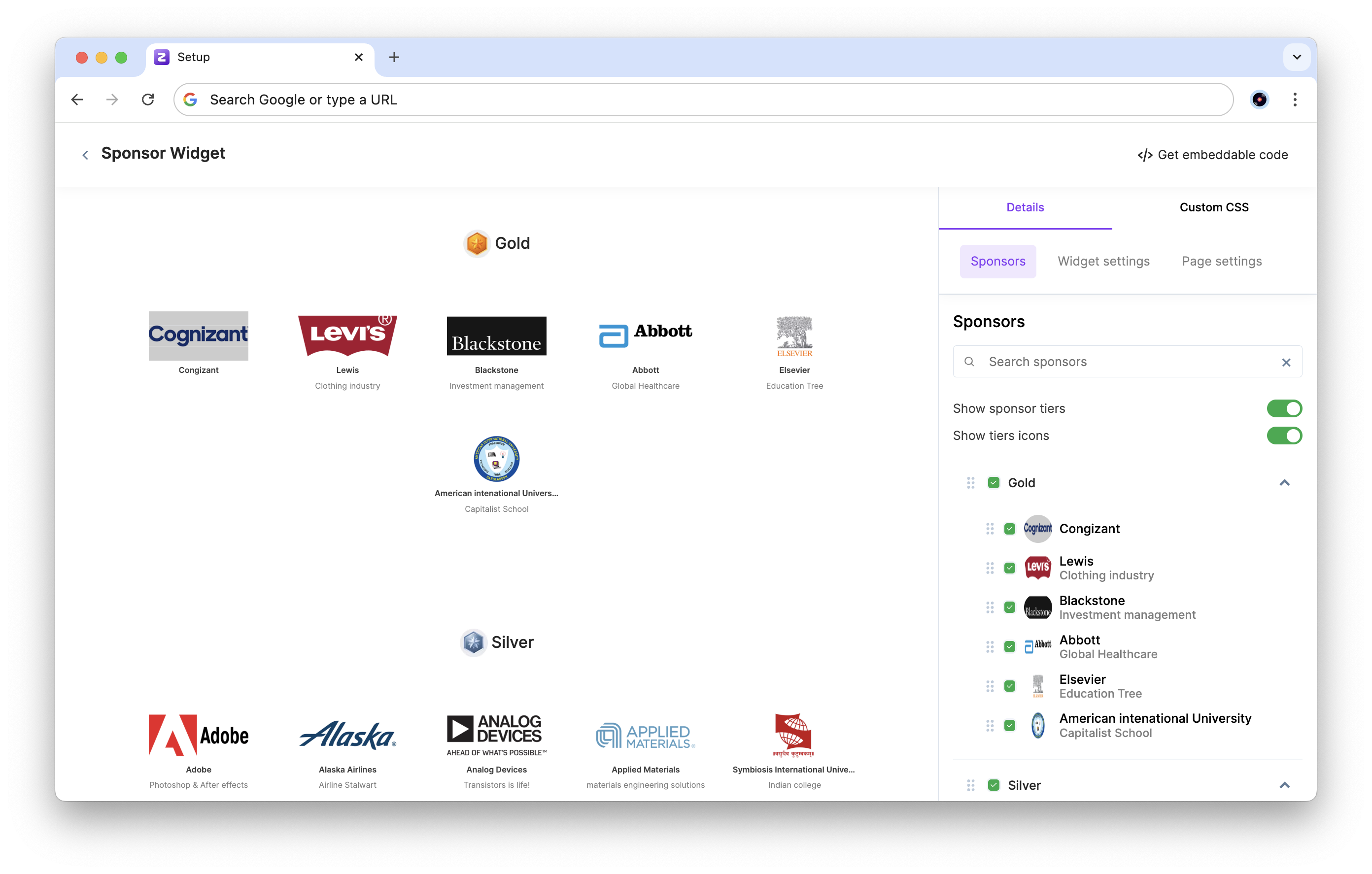
- In the Sponsors section on the right side panel, turn on/off the Show sponsor tiers toggle. This lets you show or hide the different sponsor tiers. Turning this off groups all the sponsors together.
- Turn on/off the Show tier icons toggle. This makes the tier icons visible (if added). You can also drag and reorder the different tiers as required.
- You can show or hide different sponsors by checking or unchecking the checkbox next to their name in the list, or reorder them by dragging the tab up or down.
- In the Widget settings section, check or uncheck the sponsor details you want to show or hide.
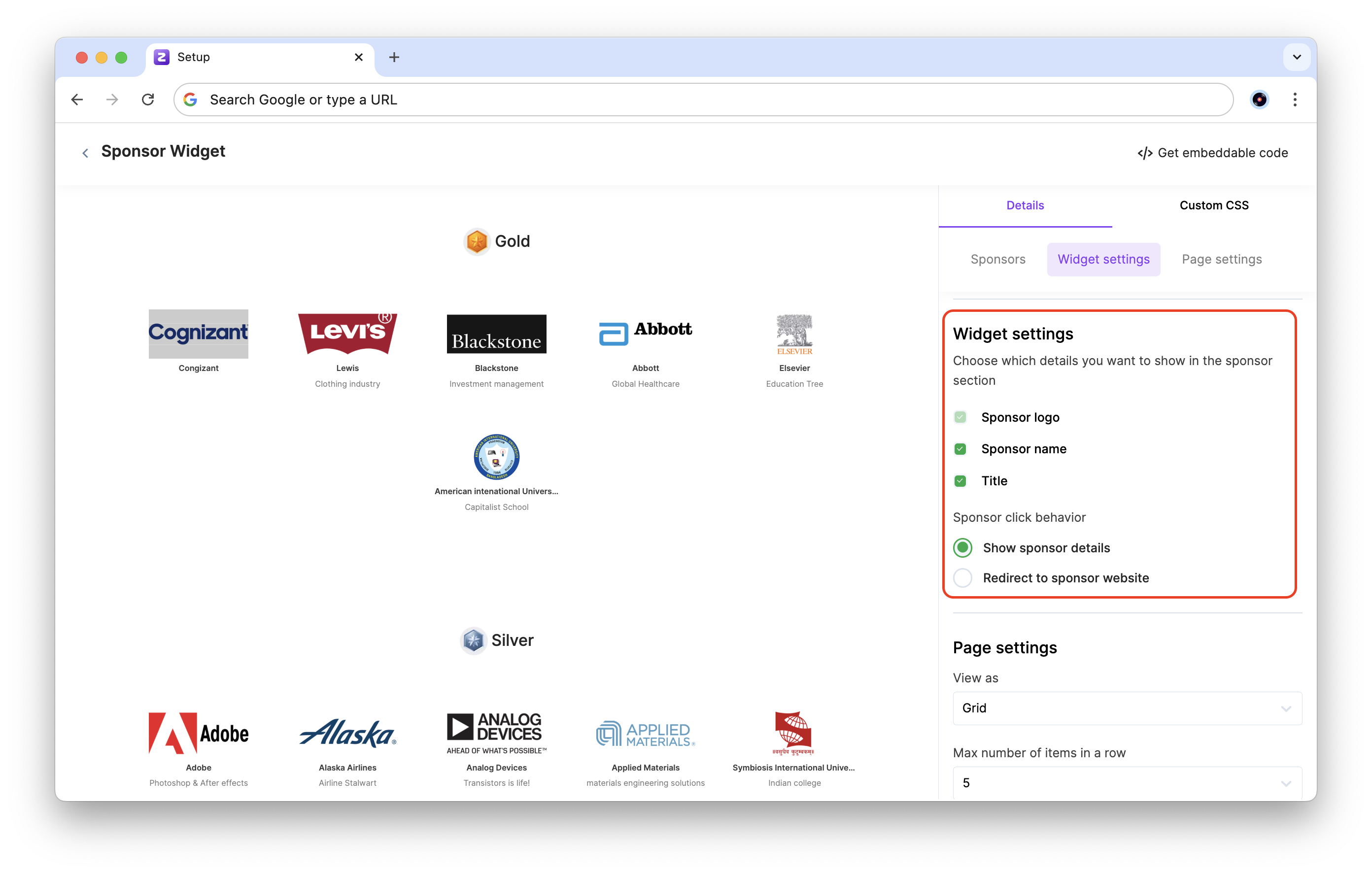
- Under Sponsor click behavior, choose the action to take when an attendee clicks on a sponsor in the widget:
- Show sponsor details: This opens a popup on the same page showing the sponsor's details.
- Redirect to sponsor website: This opens the sponsor's website in a new tab.
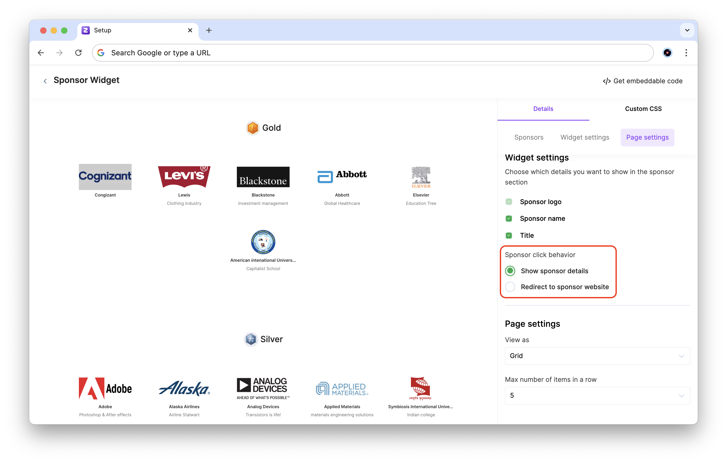
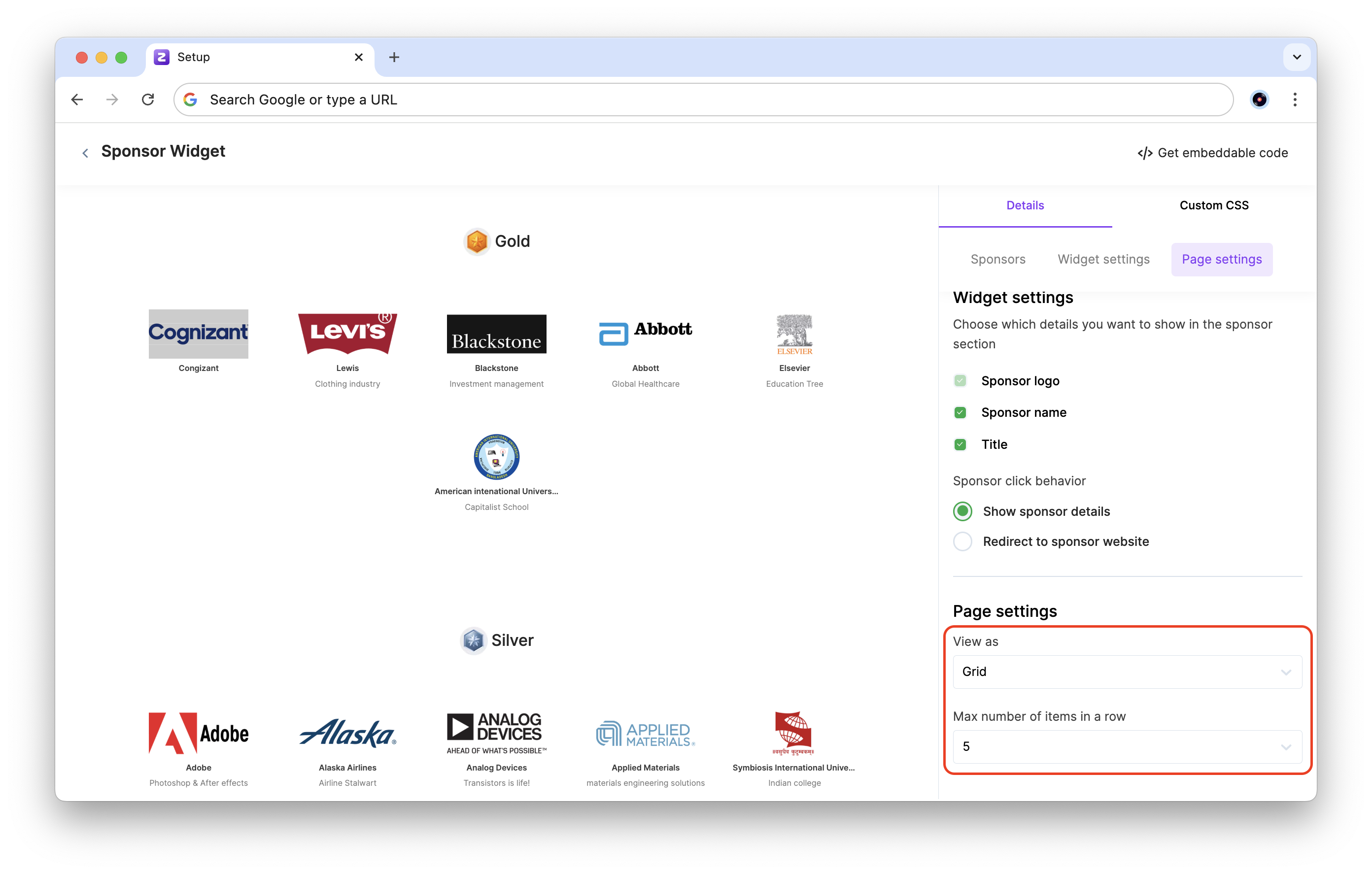
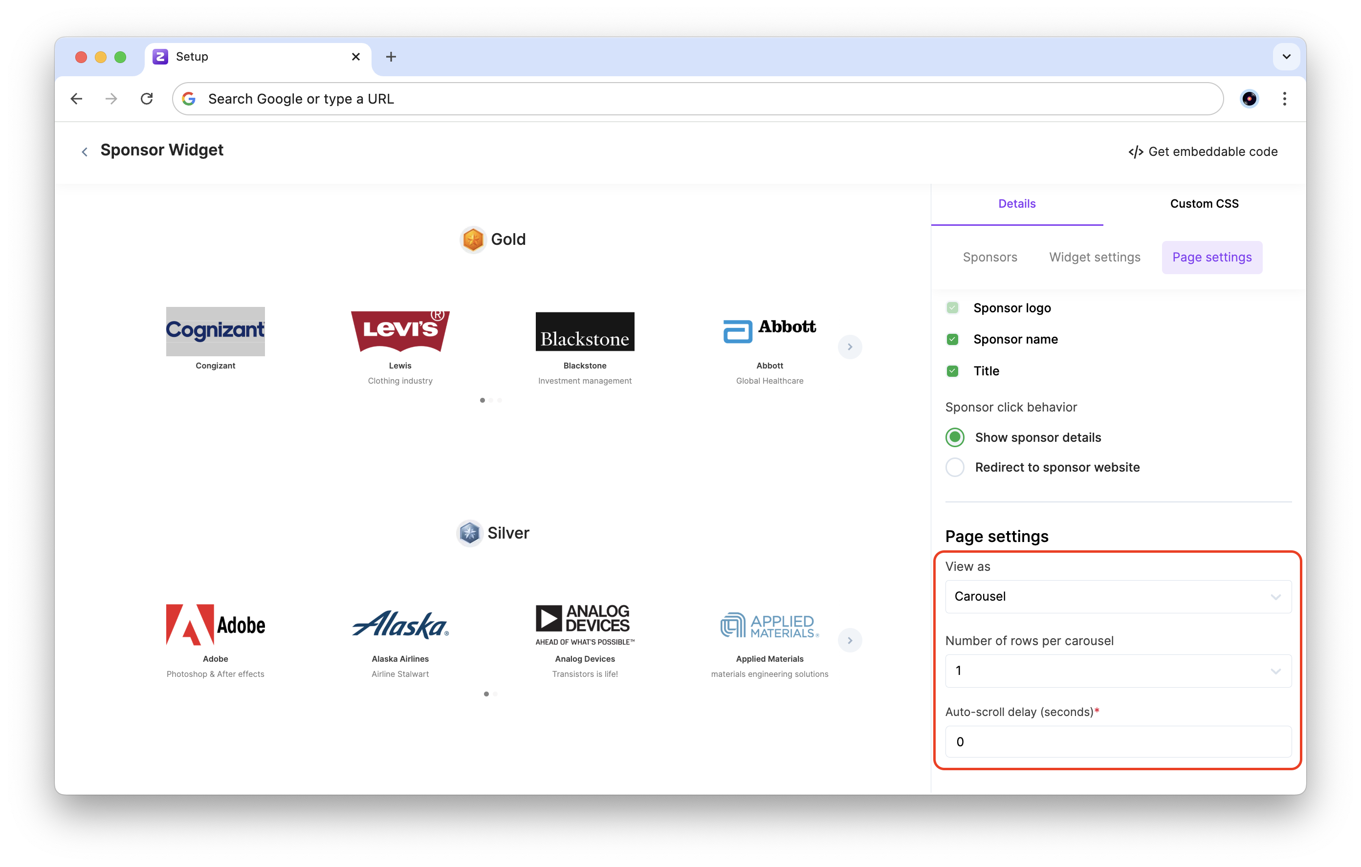
- In the Page settings section, choose how to display the sponsors from the View as drop-down:
- Grid: This shows the sponsors in a grid format. Under Max number of items in a row, choose how many sponsors to display per row in the grid.
- Carousel: This shows the sponsors in a scrolling carousel format. Under Number of rows per carousel, choose the number of rows to use in the carousel. Enter the Auto-scroll delay (in seconds).
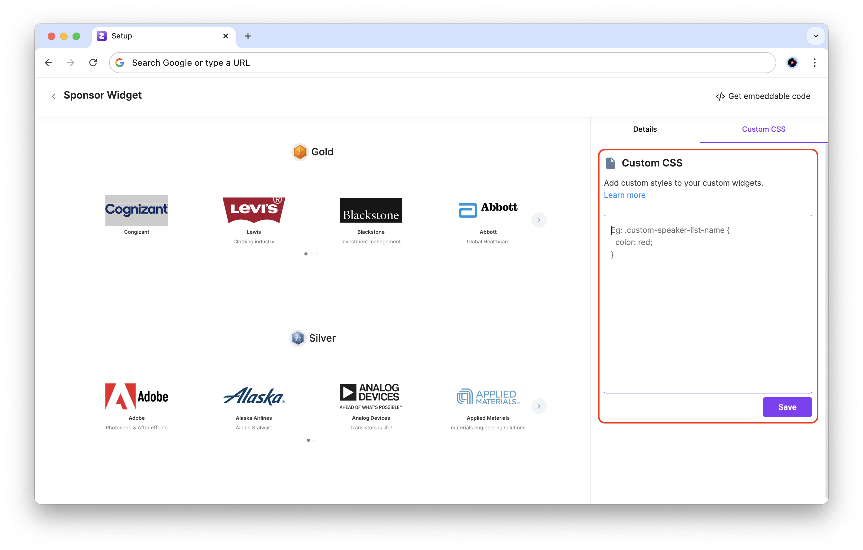
CSS classes for the widget
Type | Custom class name | Duda class name | Description |
|---|---|---|---|
all-sponsors-list | custom-sponsor-items-list-background | duda-sponsor-items-list-background | The sponsor's list background on widget. |
sponsor-item | custom-sponsor-item | duda-sponsor-item | An individual sponsor from list of sponsors |
sponsor-item-logo-container | custom-sponsor-item-logo-container | duda-sponsor-item-logo-container | An individual sponsor's logo image from the list. This is applied on the |
sponsor-name | custom-sponsor-name | duda-sponsor-name | An individual sponsor's name in the list |
sponsor-title | custom-sponsor-title | duda-sponsor-title | An individual sponsor's title in the list |
grouped-sponsors-list | custom-sponsor-grouped-items-list | duda-sponsor-grouped-items-list | When sponsors is grouped in tiers, this selects a list of sponsors in a particular tier, including non-tier grouped sponsors. |
grouped-sponsor-tier-header | custom-sponsor-tier-header | duda-sponsor-tier-header | When sponsors are grouped in tiers, this selects the entire header for all tiers. |
grouped-sponsor-tier-names | custom-sponsor-tier-names | duda-sponsor-tier-names | When sponsors are grouped in tiers, this selects names of all tiers. |
grouped-sponsor-tier-icons | custom-sponsor-tier-icons | duda-sponsor-tier-icons | When sponsors are grouped in tiers, this selects tier icons of all tiers, as applied on the |
sponsor-modal-background | custom-sponsor-popup-background | duda-sponsor-popup-background | The sponsor's detail popup modal background. |
sponsor-name-on-modal | custom-sponsor-popup-name | duda-sponsor-popup-name | The sponsor's name on popup modal. |
sponsor-logo-on-modal | custom-sponsor-popup-logo | duda-sponsor-popup-logo | The sponsor's logo image on popup modal, is applied on the |
sponsor-title-on-modal | custom-sponsor-popup-title | duda-sponsor-popup-title | The sponsor's title on popup modal. |
sponsor-bio-on-modal | custom-sponsor-popup-bio | duda-sponsor-popup-bio | The sponsor's bio on popup modal. |
sponsor-social-links-on-modal | custom-sponsor-popup-social-links | duda-sponsor-popup-social-links | The sponsor's social links on popup modal. |
sponsor-modal-close-icon | custom-sponsor-popup-close-icon | duda-sponsor-popup-close-icon | The close icon on sponsor popup modal. |
| sponsor-tier-order | custom-sponsor-tier-order-{{order}} | duda-sponsor-tier-order-{{order}} | This refers to single tier with it's order appended on the classnames. |
Embed the sponsor widget
- Click on the Get embeddable code button to view the embeddable link.
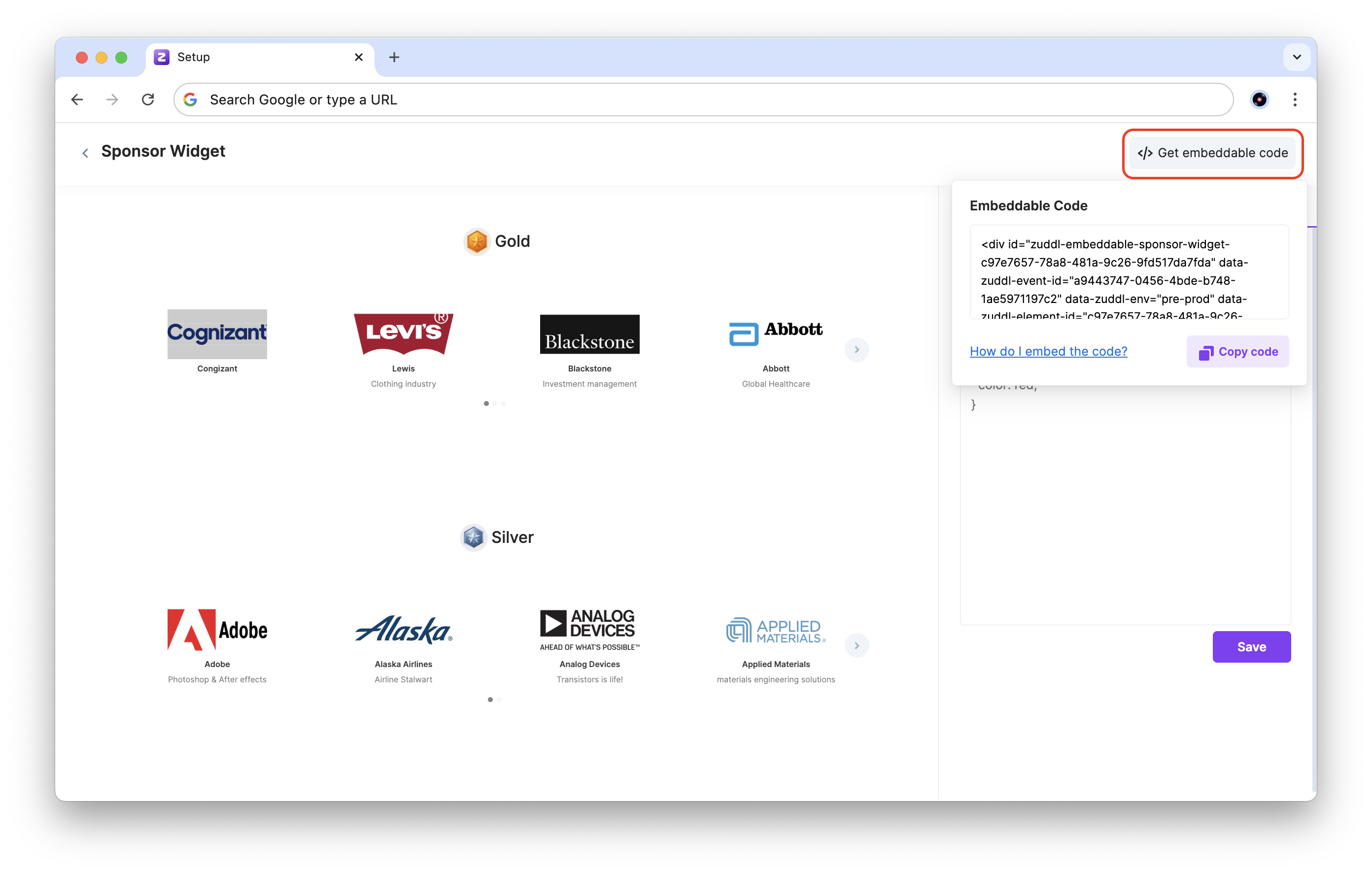
Click on the Copy code button. Paste this code in your HTML webpage inside the tag.
- The sponsor widget will be visible to visitors viewing the website. Any updates to your sponsor's list or details will automatically be reflected in the embedded widget.