How to Brand your Zuddl Webinar
Last updated: November 19, 2025
Apply your Branding
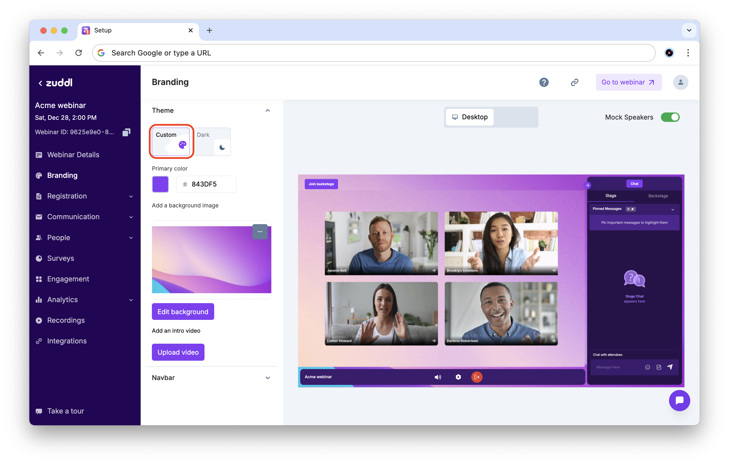
Choose a theme
You can choose a visual theme for your webinar between two options:
1. Custom: The custom theme lets you select a single primary color, which is used across the webinar interface.
2. Dark: The dark theme uses a dark background and lighter elements in the interface. Additionally, you can also choose a primary color and a text color to customize your webinar.
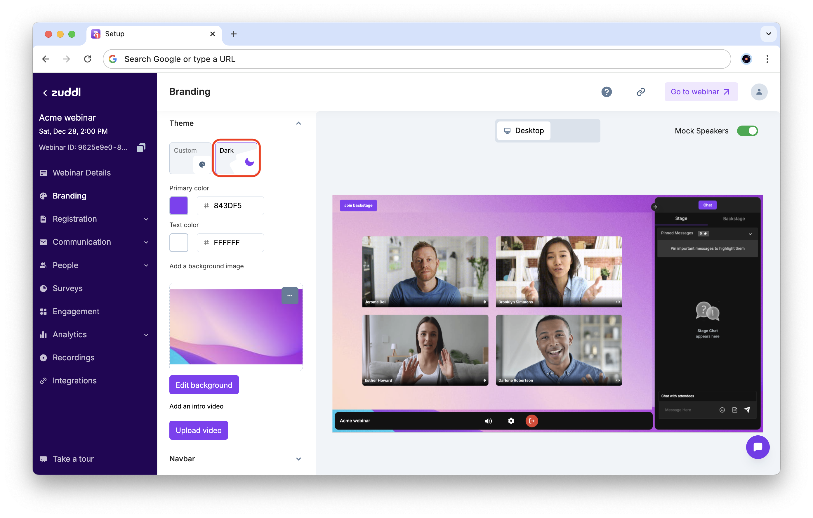
Add Brand Color
Click on Theme > Primary color. You can add your color either by pasting a hex code or by choosing a color from the color picker.
This primary color is used for all primary actions and highlighted sections.
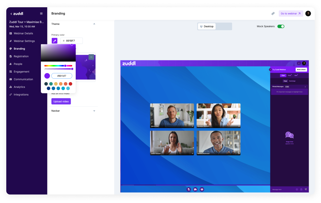
Choosing your Brand's Primary Color
This primary color is applied to major sections of the interface, and we recommend using your brand color to highlight it here. Zuddl will automatically select the secondary color. If your primary color is very bright, we will automatically select Black as the secondary color. If your primary color is very dark, White will be the secondary.
Add a background image
This image is applied all across the webinar's interface. When there's no video on stage, this background is displayed on the entire screen. However, once the webinar begins, your video will cover the background.
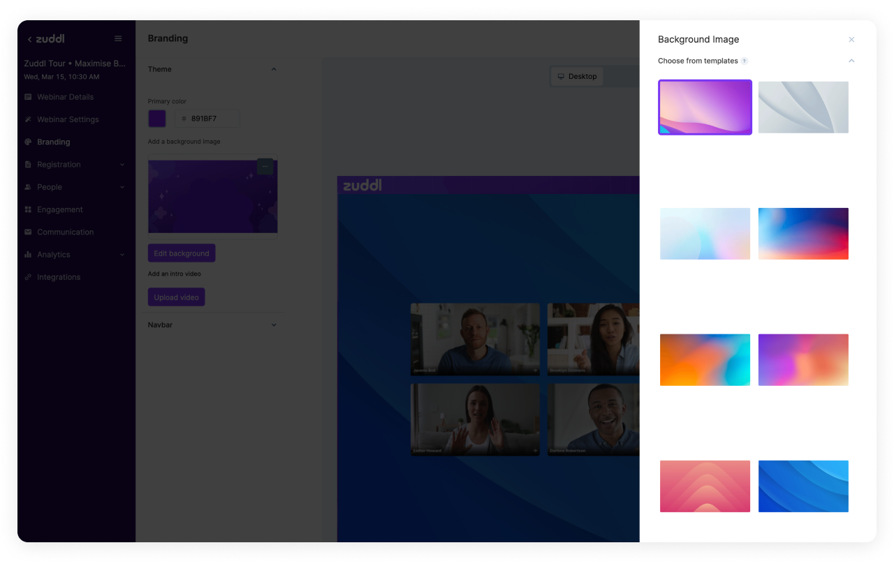
Choosing a background from Zuddl's library
You can also upload your own background image by scrolling down:
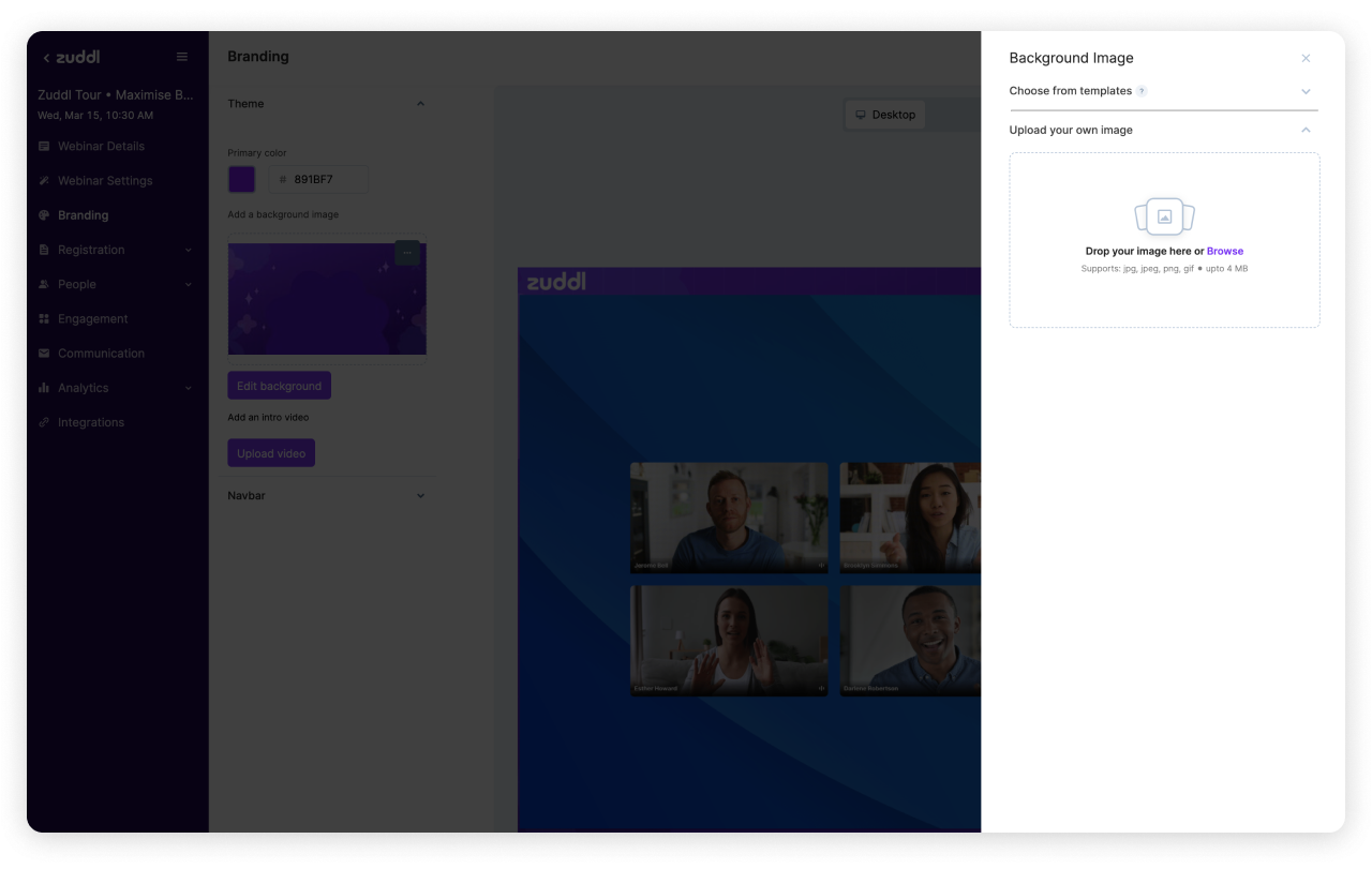
Adding your own custom Background Image
Make sure you upload a high-resolution 1920 x 1080px image. Make sure you design it keeping in mind the sidebar and the center webinar video container.
Add an intro video
You can add a short video or trailer for your webinar. This video will play the first time your attendees enter the webinar. They will have an option to skip or mute this video.
To add an intro video, click on 'Upload Video' > Select your video file.
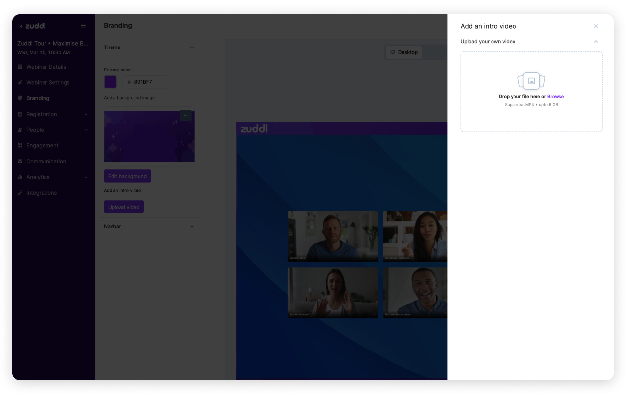
Adding your own intro video
Make sure you upload a high-resolution 1920 x 1080px .MP4 video. We support sizes up to 6GB. However, it's best if you compress your video with a tool like Handbrake. The smaller the size, the faster it loads online.
Important tips for your intro video:
Try adding subtitles to your intro video. It makes your content more accessible.
Avoid using long trailers; people appreciate short and crisp intro videos.
You can use this intro video to build excitement and share what your attendees can expect from the webinar.
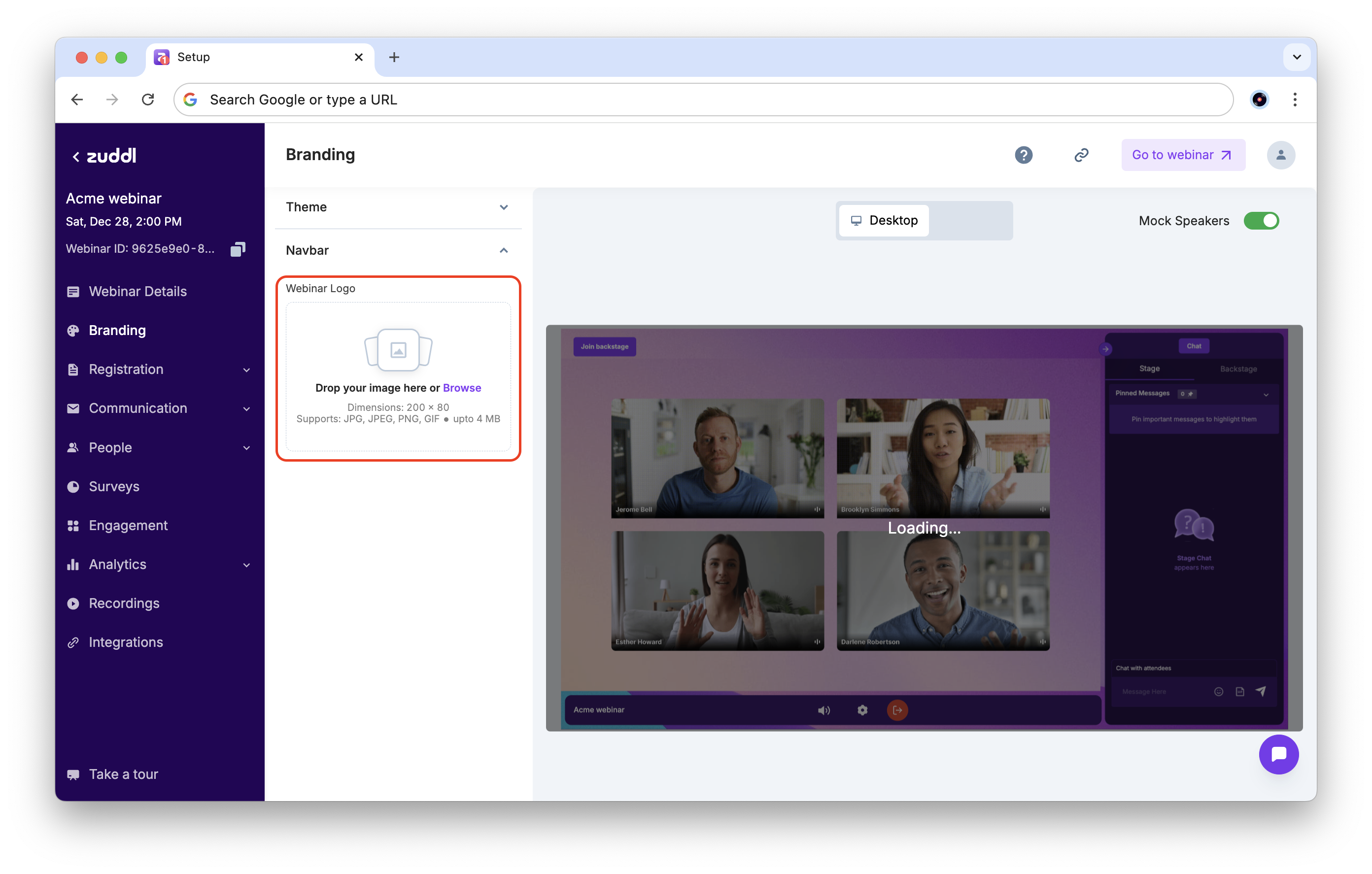
Customize the Navbar
The upper navigation bar (Navbar) for the webinar shows the different sections and can be customized with a logo.
Upload your Logo
You can upload the navbar logo to be shown on top of your webinar, in a PNG format.
We recommend using a wide image, since wider logos are more legible on the navbar.